In 1996, Supreme Court Justice David Souter told a congressional panel that “the day you see a camera come into our courtroom, it’s going to roll over my dead body.” While the controversy over whether or not cameras should be allowed in courtrooms rages on, sketch artists remain fairly non-controversial, covering even the most important trials. The general public sees their artwork on the news, online, and in print. These artists see the trials for us, and often their artwork is our only glimpse into the proceedings.
I found myself wondering who these artists are. Is courtroom sketching a full time job? Are these people fine artists or commercial artists? And what kind of artwork do they do outside the courtroom? I decided to contact a range of courtroom sketch artists and see what I could find out. There are many more talented artists in courtrooms than just the seven I contacted, and I present them in no particular order. (All artwork shown with permission of the artists).
MONA SHAFER EDWARDS
In the courtroom: Mona has been covering celebrity trials in Los Angeles for more than 25 years. Her courtroom sketches have appeared on ABC, CNN, Entertainment Weekly, the Los Angeles Times, and elsewhere. She recently released a book called Captured! featuring sketches and commentaries from a quarter century of celebrity trials.


Outside the courtroom: Before she began sketching trials, Mona was a fashion illustrator. She has illustrated several fashion books and has taught fashion sketching at UCLA. Some of her fine art is available in posters from Winn Devon. I think she conveys a lot of elegance in seemingly simple lines.


On the web: www.monaedwards.com
STEVE WERBLUN
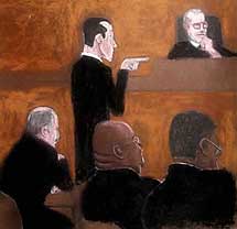
 In the courtroom:In 1975, Steve was passing through Philadelphia on his way to Hollywood, when a photojournalist friend offered him a press pass to watch the moving of the Liberty Bell with him. As luck would have it, the bad weather that day prevented the photographers from getting the shots they needed, but the fact that an illustrator was present meant that the media could at least get an artist’s rendition of the event. The Philadelphia Daily News was impressed by his work and asked if he’d ever done courtroom sketching before. He hadn’t, but he was willing to give it a try. For nearly 30 years since then, Steve covered court cases for every major media outlet, drawing his courtroom pictures with color markers. A drawing Steve made of Judge Lance Ito, his staff, and all the major players from the OJ Simpson trial hangs framed above the juror box in Judge Ito’s courtroom.
 Outside the courtroom: Steve finally made it to Hollywood, where he has a prolific career drawing storyboards for major motion pictures including The Day After Tomorrow, Along Came Polly, and Dirty Dancing: Havana Nights. Steve also does fantasy and sci-fi illustration and is working on a book of stories from his illustration adventures. Here’s an example of his storyboard work for The Day After Tomorrow:

On the web: www.stevewerblun.com and www.famousframes.com
MARILYN CHURCH
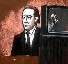
In the courtroom: From 1973 to 1998, Marilyn worked for WABC in New York, covering some of the city’s most famous trials. She was there for the courtroom appearances of Woody Allen, Martha Stewart, Don King, Sid Vicious, Mick Jagger, and more. In a 2006 interview, she recalled drawing notorious mob boss Jon Gotti: “He was always turned out in his Armani suits with his hair blown out and back, he exuded charisma. I saw him as terrifying. I used to watch him through binoculars. And one day he wagged his finger at me and pointed to his neck. I had been drawing his fat neck, and he didn’t like it.” Marilyn recently released a book called Art of Justice recounting 30 infamous trials from the artist’s perspective.


Outside the courtroom: Besides her illustrious career as a courtroom sketch artist, Marilyn is an accomplished painter whose post-impressionistic work has earned several solo exhibitions. Here are some examples:


On the web: www.marilynchurch.com and www.courtroomartonline.com
PATRICK FLYNN
In the courtroom: Patrick recently moved to a state that allows cameras in the courtroom, which pretty much put the kibash on his courtroom sketch art. But for 10 years prior to the move, Patrick’s courtroom art appeared in numerous regional and national press. I quite like his style, which he executes in chalk pastels and colored pencils (“very messy” he notes) because it’s not exactly what I imagine when I picture typical courtroom sketch art. These sketches are from the Kirby Puckett trial and the Marilyn Manson trial:
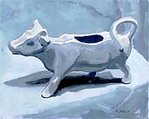
Outside the courtroom: Patrick describes himself as “a reality-based artist” adding, “I do still lifes, landscapes, and illustrations that make wry comments and witty observations on modern life.” His website features oil paintings depicting Bob’s Big Boy, a series of Pez Dispensers, and a cow-shaped creamer. Others depict seemingly mundane corners of suburban landscape. And his portfolio is rounded out with commercial work showing both creative and technical illustration skills.

On the web: www.3flynns.com and www.simplysilhouettes.com
DANA VERKOUTEREN
In the courtroom: Dana says that the most memorable court case she’s sat in on was NBC Sportscaster Marv Albert’s sexual assault trial, which she describes as “one big surprise after the next.” In that case, Albert was accused of biting a woman, and it was revealed that he sometimes wore women’s underwear. Sometimes, Dana says, time restraints don’t allow her to finish her sketches in the courtroom, so she adds the finishing touches afterwards, even if that means setting up shop in the courthouse bathroom, using the sink for her watercolors. Dana’s courtroom art has appeared on CNN, ABC, FOX, and elsewhere.


Outside the courtroom: Dana’s illustrations have been featured in national publications like Newsweek, which used her work extensively for its article “The Day That Changed America” about the attacks of 9/11. On a more local scale, Dana does commissioned portraits for clients, and is even available as a caricaturist for events.


On the web: www.danaverkouteren.com
PAULETTE FRANKL
In the courtroom: Paulette says about courtroom art: “Being a courtroom artist is like capturing lightning in a jar. The artist must grasp the image of the moment, hold it, and express it onto an 11x14 drawing pad in their lap without spilling ink, paint or supplies onto the lap of the person sitting beside them. The composition must tell the story at a glance. In all my art I go for essence. The essence of my subject in the mood of the moment is my goal. I have written a biography with artwork of the great radical criminal defense lawyer J. Tony Serra, and I’m working on a book about the world’s greatest mime, Marcel Marceau. I learned about essence from Marceau and about drama in the courtroom from Serra.”


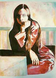
Outside the courtroom: In addition to being a courtroom artist and author, Paulette is also a photographer, a magician, a mime, and a fine artist who work was first exhibited in a joint show with her father, designer Paul T. Frankl. Here are two of her portraits:

On the web: www.pauletteart.com
ART LIEN
In the courtroom: The United States Supreme Court is Art’s regular beat, drawing for NBC News. But he has covered cases across the country, and even as far south as Guantanamo Bay where his sketches are the only visual records of various military proceedings. He began doing courtroom sketches in 1976, and works mostly with colored pencils and watercolor markers. I asked Art what he thinks of cameras in the courtroom. He said, “My fear is that trials could become reality shows. The viewing public, not realizing that the trial they are witnessing, with commentary from pundits and sandwiched between commercials, is very different from the case the jury gets.” Here is Art’s sketch of last week’s Supreme Court arguments in the Exxon Valdez case:

Outside the courtroom: Art’s courtroom work make up most of his visual artistry these days, but he does practice two other kinds of art that I think are worth mentioning. First of all, he writes an interesting blog where you can see Art’s latest drawings, along with commentary about the cases he covers. And until recently, Art was playing Mandolin in the Baltimore Mandolin Orchestra. You can see Art in this photo, partially obscured, third from the left:

On the web: www.courtartist.com
Thanks to all the artists for their participation!


 There’s


 Back in December of 1998, a friend handed me a role of 35mm color film and asked me to take photos of anything at all, and then give the roll back for her to develop. She wouldn’t tell me why, or what she planned to do with the photos. (I eventually learned that she planned to use the images as creative inspiration for a short story project, with me as her unwitting collaborator).


 I landed on the show while flipping through the channels and it caught my eye because I suddenly realized that the 80s actor I really want to see make a lamp on Martha’s show is Anthony Michael Hall. Martha can show him how to finally make an elephant lamp with a light that turns on when you pull the trunk. Who do I need to talk to for this to happen? Do I need to start a petition? Does it need to coincide with something for him to promote? The eventual Breakfast Club release on Blu-Ray, perhaps (whenever that happens)? What would be a better promotional event than this one?


 Time-lapse portraits of a face may be the most obvious and compelling subject matter, but I think science and curiosity might benefit from time lapse portraits of other body parts, too. What if Noah had been taking a second picture all this time, of, say, his left hand? It would be interesting to see how his hand ages along with his face. There probably wouldn’t be much change now, but as he ages it would get more dramatic.
 I know I’m becoming a High Def snob when I don’t even visit the standard definition stations anymore. But for some reason I was slumming it in basic cable today when I came across a channel I’d never really looked at before:
 There are a handful of artists out there making incredibly detailed
  Each company could pick one artist each year whose work exemplifies the company’s brand or ethos, provide financing for a year during which the artist develops a body of work, and then offer a performance or exhibition space — perhaps in a flagship store or corporate headquarters — to showcase the result.
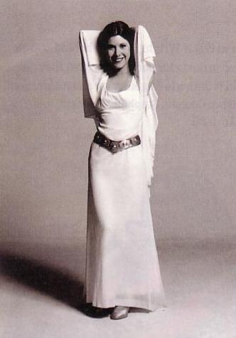
 I started out trying to literally depict that scene from Star Wars using letterforms, intending to use bold letters for Vader and light letters for Princess Leia. I loved the idea of the @ sign filling in for Leia’s hair bun. But after a few attempts I concluded that I’m no

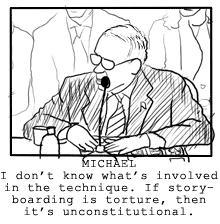
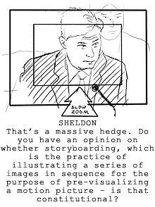
 America has a serious question to answer about storyboarding. I’m not talking about whether or not storyboard artists should join the writer’s guild and go on strike this week, or about whether “storyboard” is supposed to be written as one word or two. I’m talking about the more serious issue of whether or not storyboarding amounts to torture. Somewhere, in a parallel two-dimensional universe, I imagine last week’s Attorney General confirmation hearing of Michael Mukasey looked something like this:

 Yesterday, I


 Wow, there was a great response to the
  I’m excited to announce that author and illustrator Adam Rex has joined with Ironic Sans to hold a contest where the prize is an original custom drawing by Adam. If you’re not familiar with Adam’s work by now, he is a children’s book author whose books are marketed for kids, but contain humor and details that are definitely of a level aimed at grown-ups. His 2006 book
  Adam has a recurring series on his new blog


 Morgan Taylor is a singer-songwriter who just released a DVD and CD set full of sing-along songs about a mellow yellow character named
  Take a look at this image. On the left, we see Gustafer engaged in one of his favorite hobbies, jumping on cake. On the right, we see a tile mosaic from a New York City subway station. Every time I see the mosaic, it reminds me of Gustafer. Coincidence?
 Hi hi hi there, droogs. This weekend, oh my brothers, I, your humble blogger and narrator, had a thought in my rasoodock to create this orange clockwork. Viddy well this malenky clock which you can hang in your domy for just a little pretty polly. Perhaps your pee and em, or some other veck or soomka you know would find this clock real horrorshow.
 A few weeks ago, I wrote about

 Designed by John Baldessari, the museum space is transformed into a surreal experience worthy of the artwork it contains. The floor is a carpeted Magritte-esque sky. The ceiling is covered with images of freeways. The guards all wear suits and bowlers, like they’ve stepped out of a Magritte painting. The entrance to the exhibit is a larger-than-life replica of Magritte’s painting
  Also, LACMA needs to check their cash registers. When I made a purchase, I received a receipt with the name of the museum misspelled. How long has it been like that? Someone should be paying more attention to detail.

 I’m beginning a new series here at Ironic Sans: occasional interviews with interesting individuals, or people working on interesting projects. I’m kicking it off by interviewing
  Just because you might be a monster, that doesn’t mean life is going to be all terrified villagers and biting. There’s a down side—monsters have problems, too. Bigfoot and the Yeti are always being mistaken for one another. Frankenstein has trouble meeting new people. Witches, on the other hand, are constantly being scrutinized by hag enthusiasts. They have clubs for that sort of thing.
 Have you seen

 Each “-ist” website has its own cute logo following the same theme: a few sillhouettes of buildings, other architecture or landmarks, followed by “citynameist.” Each one also features a different colorful background. The original Gothamist logo, above, was designed by Sam Park, of


 My friend and fellow photographer
 The radio station 1010 WINS is for New York City what CNN Headline News is for cable television. It’s just nonstop headlines, weather, and traffic, repeating every 22 minutes. Their slogan is, “You give us 22 minutes, and we’ll give you the world.” Their website,
  The crown jewel of the 1010 WINS Art Collection is Peace Grannies on Trial for Times Square Protest. For
  It’s a classic struggle for every artist. How do you illustrate a
  The influence of conceptual artist
  Nearly five years after the tragic events of September 11, 2001, audio tapes were released featuring conversations between 911 operators and people trapped in the World Trade Center. For the event, the 1010 WINS artist created this commemorative work. On the day the tapes were released, a cell phone was so clearly important — a modern technological luxury but also an icon of this day in history — that it seemed like an object as large as the towers themselves. Or perhaps slightly larger, in black and white, looking a bit like it was photocopied and then faxed a few times before being scanned in for a montage.
 The ashy, veiny hand reaches out, gas pump nozzle in hand, a stream of “S”es pouring forth from its spout like precious drops of gasoline. Together, the hand and pump give off an eerie glow as Honest Abe looks onward, his gaze obstructed by an exaggerated dot screen. George Washington is barely visible, shrouded by an orange shadow of depression. The


 I had the pleasure this evening of attending the opening of a new exhibit at the


 It seems these days that Hollywood scrapes the bottom of the barrel for movie material. Of the movies opening this summer, 7 are sequels and 17 are remakes or adaptations.
 I saw this banner outside a museum last week, and I had to take a picture. I haven’t seen such a confusing use of type is a long time.
 If you’ve ever walked through the science fiction and fantasy section of a bookstore, you’ve seen the artwork of Boris Vallejo. This weekend, I got to watch him create one of his paintings, a rather detailed picture of a dragon that he completed in only four hours.


 The MOBA was founded when a particular oil painting, later dubbed “Lucy in the Field With Flowers,” was pulled from a streetside garbage. The woman in the painting, later identified as Anna Lally Keane, bears a striking resemblance in pose and wardrobe to the woman in the viral video.