(The fourth in a series of occasional interviews with people I find interesting or who work on interesting projects.)
Fifteen years ago, I spent a Friday night camped out on the mezzanine level of 30 Rockefeller Center, hoping to get one of the standby tickets to Saturday Night Live that are handed out on Saturday mornings. The line forms at around 8:00 Friday night. That’s when I met Louis Klein, the SNL fan who had seen almost every episode of Saturday Night Live in person, going back to the very first episode.
Last Friday, I decided to go back to the SNL Standby Line and see if Louis was still waiting in line to get his ticket. In the years since I camped out there, the line had moved from the warmth of the indoor mezzanine to the chill of 49th street, but Louis was still there, right behind a group of teenagers who beat him to the first spot (one of the teens asked about my website, “Ironic Sans? Does it have anything to do with Horatio Sanz?”). When Louis stands in line these days, he is accompanied by his wife Jamie, whom he met on-line around six years ago. And by “on-line” I mean on the internet, not the standby line.
I spoke with Louis about his SNL Standby hobby.
When Saturday Night Live started, nobody knew it was going to be a big hit. Why did you go to the first episode of a new show that nobody really knew?
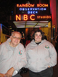
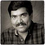
Louis Klein with his wife JamiePrior to SNL, I was going to a lot of game shows. Like, I watched the game show called Jackpot, which was done in Studio 8H prior to SNL. It ended its run in the summer of ‘75, hosted by Geoff Edwards. I was also going to the Pyramid — any one of them, whether it was 10, 20, 25, 100 thousand, 2 cents, you know, whatever it was. I went to all of them over at TV-15 which doesn’t exist anymore. Any game shows that were done here, if any, I went to them also. So I was notorious as far as NBC was concerned. They knew who I was because I went to all the shows.
Then in April of ‘75 I found out that the show SNL was coming up, so I went to the Guest Relations department and said I hear you’re doing this show. They said, Well, they want 500 people in 8H. They want to do a show that’s going to be a run through for sound purposes. We’re going to have an audience for that, and you can float around the building and find somebody who’s going to give out standby tickets. So I come over here right after work, and I found the standby ticket and I got it and I went inside and I stood in line.
I got upstairs. I saw a full fledged comedy routine by George Carlin. I saw a full fledged comedy routine by Billy Crystal. I saw performances by Janis Ian and Billy Preston. I saw comedy by the Not Ready for Prime Time Players including Jon Belushi and Gilda Radner among others. Now that’s three and a quarter hours of pure entertainment for free. And I could come back tomorrow night. And I did. And I got in a second time. I came back the following week and I didn’t get into the second show but I wasn’t going to give up at this point. This is a great thing to do on a Saturday night. I went to the third show, I got in, and in the first 5 years I’ve seen 59 out of 106 [episodes].
At what point did you realize it was turning into something you were making a regular routine?
I never really thought of it that way at that particular time. It was just something to do on a Saturday night. I just came over. If I got in, I got in. If I didn’t, I went home.
My memory from meeting you 15 years ago was that you had seen every episode live except for a few. But I guess you’ve missed more than that.
In the first 5 years I’d seen 59 out of 106. So I missed 47 shows then. To date I’ve missed I think 83. That means in the last 27 years I’ve missed 36 shows.
How many have you seen?
This is my 528th show.
The original producer, Lorne Michaels, is still with SNL. But he left the show for a few years in the middle. So is there anyone who outnumbers you in the number of shows attended?
Don Pardo. He only missed one year. It was the ‘81 season.
How come after all this time you still have to wait in the Standby Line? Why don’t they just give you season tickets?
They do. I’ve had season tickets since 1990.
But you just enjoy the Standby?
When they gave that to me, they asked me to do Standby anyway, just in case the tickets didn’t come through. So I have the standby tickets to back it up. However I never needed them, and now I just walk in. But I still do standby because I’m helping NBC out watching this, make sure people don’t jump and things like that. It helps them out. If something goes wrong they know that I’ll take care of it. And then I give the details to them later in the evening. If they have to do something about it they’ll do something.
What’s the worst thing you’ve seen go wrong while on standby?
Jumping the line, and having people join the line. That’s a no-no, because basically the people who are joining are jumping the line. Once somebody tried to get me off the line. This was for the Soundgarden and Jim Carrey episode. We were all standing inside because there was nobody out here, and then all of a sudden somebody let me know that somebody was out here and so I came out, and he was standing over by the pole over here, two guys, and I said all the standbys are inside. He said, Oh, I’m sorry. This is where the line is and I’m going to be number one and two. Well I said, No, I’m number one. He says no, we’re going to be number one. And he argued with me all night at this pole. And I was a little perturbed about it because they weren’t really nice about the whole thing. Well when they didn’t take any standbys for the dress rehearsal, these two guys nearly blew their top to NBC. They said, A standby got upstairs! So NBC checked to see if any standby tickets were upstairs, but I went up on my regular ticket. Little did they realize, I went to the party that night!
Do you get to go the after-party often?
Only the season finale, if they ask. Sometimes they do, sometimes they don’t.
When I was here 15 years ago, the line was inside. When did they move it outside?
‘93. Letterman was still here at the time, and according to what I’ve heard, somebody did damage to the building inside in the mezzanine. So Rockefeller Center said no you can’t be up here anymore, because they have to protect their tenants. And as a result all the lines were put outside. The line started at that time on this side of the building. And then NBC put it on the 50th street side because the Rainbow Room was complaining that we look like homeless people. Now we’re back on this side. We’d love to be inside the building again. They’ve got plenty of room on hand. But that’s not going to happen.
I seem to remember that 15 years ago you told me Tim Kazurinsky mentioned your name during a Weekend Update segment.
No, no. Not Weekend Update. It was in a sketch that he did. The Guru sketch. His name was Havnagootiim Vishnuuerheer [pronounced “havin’-a-good-time wish-you-were-here”]. What he was doing was he was answering Unanswered Questions of the universe. So he invited everybody in the country to write in unanswered questions that they had, and he picked one of mine, and all of a sudden I’m at dress rehearsal and he says, “Louis Klein from Ridgewood New York wants to know, does God wear Pajamas when he sleeps?”
And what was the answer?
The Guru says, “No he doesn’t. All he wears is a t-shirt. and on the t-shirt it says I created the universe and all I got out of it was this lousy t-shirt.” That was a Flip Wilson show in December ‘83.
Did they mention your name on any other episodes?
Yes, they did. And Jamie too. This was in April of 2004. Will Ferrel was the host. And he was doing the Pepper Sketch, where Will was putting pepper on Will Forte’s salad. And the character’s name was Dr. Louis something, and his wife Jamie. In honor of my 500th show.
Who was the writer that wrote you into the script?
Will Forte.
Have you seen “Studio 60” and Tina Fey’s new show “30 Rock”?
I have.
What do you think?
They’re both great.
Which do you like better?
Oh I don’t know. I love Tina. I love Tracy [Morgan], too. And I relate more to 30 Rock than I do Studio 60 because of that. But I definitely like both shows.
Do you get to know the SNL cast members?
They all know me. They all come and say Hi. I’ve met most everybody. I was invited to the 25th anniversary show, and I went to that. I had to ask for a ticket, and they said that they already have a ticket for me. I was fairly shocked.
Do you have a favorite season of SNL? Or a least favorite season?
That’s a hard question. A favorite season? You know, I don’t remember what all the hosts and musical guests are, and it’s hard. I love them all. I mean, yes, you’re going to have somebody that doesn’t do too well, especially sports figures. I mean, if you want a show that I thought the host was terrible, okay, um… uh… there was… uh… I can’t even say that. I mean, I don’t want to hurt anybody’s feelings.
Thanks, Louis! As I packed up my notes and my recorder, Louis pointed out that he would be there for several more hours if I had any further questions. And if you have any questions, I’m sure you can find Louis exactly where I did, near the front of the Standby Line outside Rockefeller Center on Friday nights.
[The preceding transcript has been edited for space and clarity].


 There’s


 In 2009, Armin Vit and Bryony Gomez-Palacio of the design firm


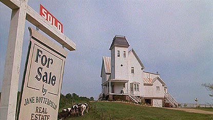
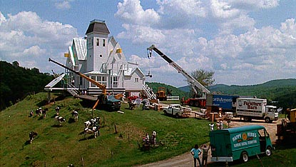
 As George Bush prepares to move out of the White House at 1600 Pennsylvania Avenue in Washington, DC, and Barack Obama prepares to move in, I thought I’d take a virtual trip around the country and see what’s going on at other locations with the same address.


 There are a lot of “O”s cereal names out there: Cheerios, Toasty-Os, etc. I had this idea that there should be a Typos Cereal. It would be made of all the letters of the alphabet, like Alpha Bits cereal, but you wouldn’t spell anything correctly with it. I only got as far as this rough illustration before I remembered that “O”s cereals don’t use the whole alphabet. They only use the letter O. Then I considered a soup called “Type O” Soup. It’s tomato soup with alphabet noodles. But that’s just too many layers of wordplay.
 I once doodled a drawing of Clifford the Big Red Log. I figured that must be the most dull children’s book ever. Then I began imagining other unsuccessful children’s books like Charlie and the Chalk Factory, Reverend Horton Heat Hears The Who, and The Berenstein Bears (about a family of burly gay men).
 We’ve all heard the theory that every person on this planet is separated by every other person by six degrees. But one day I realized that something else is separated by six degrees. Every minute on a clock face is separated from the previous and next minute by six degrees. I think there might be something interesting that an be done with that concept. I tried coming up with a clock design incorporating the idea, playing with the six on the bottom of the clock in the designs, but I wasn’t crazy about anything I came up with.


 Method 1: Placing one hand on each side of the frame, use the fingertips or midfingers of both hands in concert to raise the glasses into a comfortable position.
 Method 2: Using the fingers of just one hand, grab the frame front securely on one side and push the glasses up into a comfortable position.
 Method 3: Using just one finger, press upward on the bridge of the frame, raising the glasses into a comfortable position.


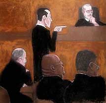
 In the courtroom:In 1975, Steve was passing through Philadelphia on his way to Hollywood, when a photojournalist friend offered him a press pass to watch the moving of the Liberty Bell with him. As luck would have it, the bad weather that day prevented the photographers from getting the shots they needed, but the fact that an illustrator was present meant that the media could at least get an artist’s rendition of the event. The Philadelphia Daily News was impressed by his work and asked if he’d ever done courtroom sketching before. He hadn’t, but he was willing to give it a try. For nearly 30 years since then, Steve covered court cases for every major media outlet, drawing his courtroom pictures with color markers. A drawing Steve made of Judge Lance Ito, his staff, and all the major players from the OJ Simpson trial hangs framed above the juror box in Judge Ito’s courtroom.
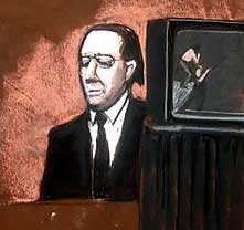
 Outside the courtroom: Steve finally made it to Hollywood, where he has a prolific career drawing storyboards for major motion pictures including The Day After Tomorrow, Along Came Polly, and Dirty Dancing: Havana Nights. Steve also does fantasy and sci-fi illustration and is working on a book of stories from his illustration adventures. Here’s an example of his storyboard work for The Day After Tomorrow:


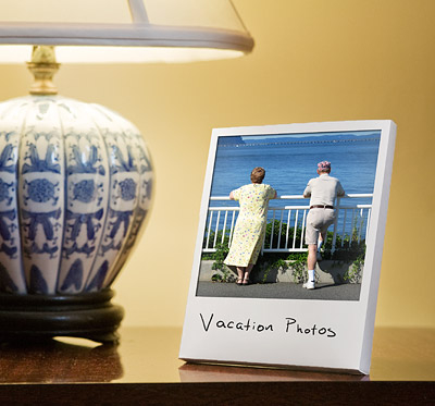
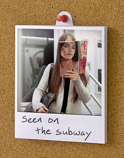 If you’re the sort of person who prefers to pin your Polaroid pictures to your cork board in your cubicle, you can take advantage of this innovative feature: The stand on the back of the frame can rotate to an upward position, sticking up above the top of the frame and revealing a hole for you to stick a pushpin through. The rechargeable internal battery allows you to showcase your photos that way even if you don’t want a wire dangling down from your cork board.


 Yesterday, I


 The Tim Burton movie


 I don’t want to go too much further into what happened, because the story was turned into the excellent 1975 movie


 There’s an article on-line from Money Magazine called “
 So how about making a Digital Jewel Box? Here’s how it would work: The DJB sits next to your stereo or computer in its charging dock. Similar to a digital picture frame, it syncs wirelessly to your home network via WiFi, syncing itself with iTunes or whatever digital player you use. When a new song comes on, the DJB’s screen shows the album cover art for that song.
 Occasionally during downtime on a particularly slow photo shoot, I’ve played this game with my assistants. Everyone takes out a piece of paper, and numbers it from 1 to 50. Then you get 10 minutes to write down every state you can remember. Finally, you compare it to the master list and see who got the most answers. 10 minutes seems like more than enough time to remember a list of 50 items, right? And yet somehow I’ve never managed to get more than 48 of them.
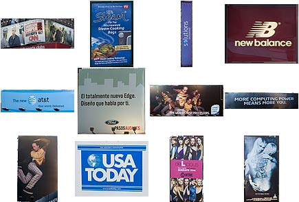
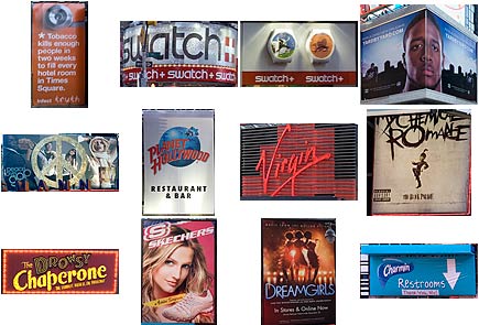
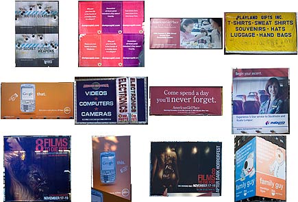
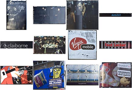
 Sometimes I get dangerous thoughts in my head, like “I wonder what it would look like to see every ad in Times Square all on one page.” So when I knew I’d be passing through Times Square this weekend, I made sure I had my camera. For the purposes of this nearly purposeless project, I considered storefront signs the same as ads if they were flashy and glitzy like Times Square ads tend to be.


 My first year in New York, I lived on the top floor of an old building in Astoria, Queens, with rotted wood floors that creaked every time I took a step. I didn’t mind so much, because my schedule was so hectic I was rarely home. I got up early every day to get to my job by 9:00 a.m. I was happy to work in a photo studio, but it didn’t pay enough to survive in this town. So at 5:30 p.m. each day I left the studio and went to a bookstore across town, where I worked until 12:15 a.m. in order to make ends meet (and another 8 hours on Sundays). By the time I got back to Queens every night, hopefully before 1:30 a.m., I was beat. I’d take an hour to wind down before finally going to bed, getting a few hours sleep, and starting over.


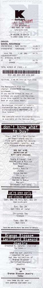 How many customers do you think it takes before K-Mart goes through a mile of paper in cash register receipts? It may not be as many as you think.


 By now, you either recognize the name, or you’re wondering who Seetharaman Narayanan is, and the difference probably depends on what you do for a living. If, like me, you have a job where you launch Photoshop on a daily basis, then maybe, like me, you can’t stop staring at this guy’s name on the Splash Screen every time it launches. Seetharaman Narayanan. It’s hard to look away. Sure, other people worked on Photoshop. But nobody else has a name like Seetharaman Narayanan.
 I was recently shopping for paper at Staples when I had this thought: NBC should really license the “Dunder Mifflin” name to some paper company, and put it on real reams of paper. I don’t have brand loyalty when it comes to 8.5” x 11” paper, so it’s not like I can’t be persuaded to buy one ream over another. If I were buying paper at Staples and I saw the Dunder Mifflin brand name on a ream of paper, I’d totally get it. Just because it’s funny. Even if it cost a few cents more than the other brands.
 Have you seen


 How does it work? It begins with a thick layer of glass or clear plastic. This protects you from the ants, and protects the ants from you. Below the glass is an open space with a thick layer of dirt, allowing the ants to crawl in, out, and around their tunnels, caves, and hills. This all rests on top of a sturdy base layer, which doubles as the bottom of the desktop. Small holes around the sides of the desk provide air, while being too small for the ants to escape.
 The radio station 1010 WINS is for New York City what CNN Headline News is for cable television. It’s just nonstop headlines, weather, and traffic, repeating every 22 minutes. Their slogan is, “You give us 22 minutes, and we’ll give you the world.” Their website,
  The crown jewel of the 1010 WINS Art Collection is Peace Grannies on Trial for Times Square Protest. For
  It’s a classic struggle for every artist. How do you illustrate a
  The influence of conceptual artist
  Nearly five years after the tragic events of September 11, 2001, audio tapes were released featuring conversations between 911 operators and people trapped in the World Trade Center. For the event, the 1010 WINS artist created this commemorative work. On the day the tapes were released, a cell phone was so clearly important — a modern technological luxury but also an icon of this day in history — that it seemed like an object as large as the towers themselves. Or perhaps slightly larger, in black and white, looking a bit like it was photocopied and then faxed a few times before being scanned in for a montage.
 The ashy, veiny hand reaches out, gas pump nozzle in hand, a stream of “S”es pouring forth from its spout like precious drops of gasoline. Together, the hand and pump give off an eerie glow as Honest Abe looks onward, his gaze obstructed by an exaggerated dot screen. George Washington is barely visible, shrouded by an orange shadow of depression. The


 It seems these days that Hollywood scrapes the bottom of the barrel for movie material. Of the movies opening this summer, 7 are sequels and 17 are remakes or adaptations.

 If you’ve ever walked through the science fiction and fantasy section of a bookstore, you’ve seen the artwork of Boris Vallejo. This weekend, I got to watch him create one of his paintings, a rather detailed picture of a dragon that he completed in only four hours.


 There should be a convention for Bob Balaban fans called Balabananza. Imagine:
 Ione Skye is upstairs sleeping in her bedroom. Outside, John Cusack stands below her window with a boombox held up high over his head. He’s blasting “In Your Eyes” by Peter Gabriel. Ione wakes up. “…the light, the heat (your eyes), I am complete (your eyes)…” Where’s that music coming from?