Entries for October 2006

October 29, 2006

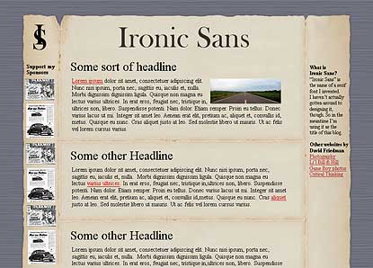
Designing Ironic Sans

Rummaging through a pile of papers today, I came across some of my original sketches for the design of this website. Before I throw them away, I figured I’d scan them in and post them here, in case anybody might be interested in seeing a little bit of the work that went into designing this website.

At first, I wasn’t really sure what this site would look like. I thought maybe it would have an art deco feel to it. I drew a few sketches before realizing that I am not very good at depicting anything art deco.

Design Concepts

Was my website even going to have a feel that would go with an art deco look? Probably not. So I came up with another idea. I frequently jot notes on pieces of paper — to-do lists, phone numbers, etc. — fold them up, and put them in my pocket. There’s something interesting to me about worn out folded old paper. So what if the website looks like it’s on a folded old piece of paper? Maybe the creases in the paper could act as dividers for the various blog entries. What would that look like?

Design Concepts

You can see two drawings there. The large sketch shows a three-column version, and the small sketch shows a two-column version. Maybe that would work. I decided to flesh it out a bit in a Photoshop mock up to see what it would look like on screen.

Design Concepts

The verdict: It sure looks ugly. I didn’t quite capture what I was hoping to capture. You can see that I was already toying with the idea of classic ads instead of actual advertising. But this design wasn’t quite right. Back to the old drawing board. I decided to forget about the look and feel, and instead think about other issues. Did I want a two column layout? Three columns? Where would the logo go? I sketched a few layout ideas.

Design Concepts

Hmm. Pretty generic layouts. But they could serve as building blocks on which to lay a design. I played around with other aspects of the site in further drawings.

Design Concepts

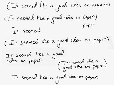
Actually, I’m not sure what I was trying to depict in those sketches. All of this sketching took place piecemeal over several weeks. I’d do some sketches, take a few days off to think about what works and what doesn’t, and exactly what kind of website Ironic Sans was going to be, and then do some more drawings. Then one day, while I had some down time on a photo shoot, I drew this:

Design Concepts

Hmm, I thought. I’ll have to do a mock-up in Photoshop. But it seems like a good idea on paper. As soon as I had that thought, I realized I had hit on a good slogan that captured what I anticipated would be the tone of my website. And it gave me a direction for my website design. It seemed like a good idea on paper.

So I folded up the paper on which I did that drawing, and put it in my pocket. When I got home, I sat down with paper, pen, and ruler, and drew lots and lots of lines.

Design Concepts

I have several pages with variations on these lines. Thick lines, thin lines, cross-hatched lines, sharp lines, freehand lines, ruler-guided lines, etc.

Design Concepts

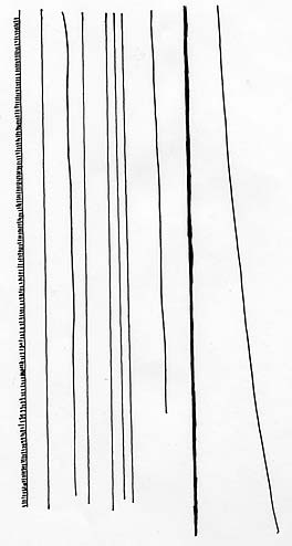
Then I drew the lines that would eventually be on the sides of the site:

Design Concepts

I scanned them into Photoshop and repeated those elements in different configurations making blog mock ups in various styles (three column, two column, etc). I don’t have the original Photoshop mock up, but it looked a lot like the drawing. I felt the site was looking a bit too cross-hatch heavy, though. All those lines dominated the page. I wanted the emphasis to be on the content, and not the design. The design should really be secondary. So I worked and re-worked it until I got it looking like you see it now.

I picked a serif font to represent the logo (Baskerville Old Face), printed it out, and used it as a basis for a freehand version of it.

Design Concepts

I liked the logo, but I wasn’t happy with how the slogan looked. So I reworked it, creating the elements that eventually appear at the top of my site.

Design Concepts

I repeated the process for the hand-written elements that appear in the sidebar and elsewhere.

Design Concepts

Then all that was left was making decisions about fonts, link styles, etc. I struggled with the CSS for a couple weeks, trying to figure out why I couldn’t get it to look the same in Firefox and IE and Safari all at the same time, and coming up with workarounds to make everything come together. Finally, after all that, Ironic Sans was born.

October 23, 2006

Animated Manhattan: Red Garden

Part 13 in an ongoing series looking at New York City in animation.

Red GardenA few weeks ago, a new animated TV series was launched called Red Garden. It’s about a group of girls who go to school together on Roosevelt Island, and they have all sorts of supernatural misadventures that begin when their friend’s dead body is found in Central Park.

At least, I think that’s what it’s about. It’s kind of hard to tell exactly because it’s a Japanese cartoon, airing in Japan, and I don’t understand a word of Japanese. But it’s interesting seeing their take on New York City. The cartoon’s rendition of Central Park looks nothing like Central Park. It looks like a dense thick forest, and not like a landscaped park. Trees like this don’t even exist in the ramble, the most densly wooded part of the park. Roosevelt Island, on the other hand, is depicted fairly nicely, with lovely views of midtown Manhattan and the Queensboro Bridge.

The show’s opening credits and a few clips can be found on YouTube. Here’s a small gallery of New York City as depicted in the pilot episode:

Red Garden Red Garden

Maybe if the show gets released in the states with subtitles, I can see what their take of the rest of the city is like, assuming they don’t spend all their time on Roosevelt Island. Maybe they’ll head East for an episode in Long Island City.

IMDb Rating: N/A
BCDb Rating: N/A
My Rating: 7/10

(My rating is for the pilot episode’s depiction of NYC only)

October 17, 2006

Running on Empty, Stopping at Studio 60

Last week I noticed that the new Aaron Sorkin show Studio 60 on the Sunset Strip featured in supporting roles two of the lead actors from one of my favorite movies, Running on Empty (which is overdue for a good DVD release, incidentally). Judd Hirsch was in the pilot episode, and Christine Lahti looks like she’ll be in several episodes this season. Will anyone else show up? Of course, River Phoenix has passed away, so there’s no chance he’ll make an appearance. And I don’t see “Studio 60” among any of Martha Plimpton’s credits on the IMDb. But tonight I noticed that Christine Lahti’s character is named Martha. Coincidence? Or tip of the hat to a great film?

Whether or not it’s a coincidence, it’s almost as good as last season of 24, which featured three actors from another of my favorite movies, Robocop. Peter Weller — Robocop himself — played Christopher Henderson, of course. But Ray Wise, who played the Vice President in “24,” was also in Robocop as one of the bad guys, and so was Paul McCrane, who played the weird guy pulling the President’s strings on “24.” Did we ever find out what that storyline was all about? Anyway, he was the bad guy in Robocop that ended up covered with toxic waste at the end of the movie before being splattered by a car. Ah, great movie. Someone at “24” must be a fan.

So I’ll keep watching Studio 60 and see if anyone else from Running on Empty appears. I hear the guy that played River Phoenix’s younger brother is looking for work.

October 16, 2006

Idea: The Mr. T Virtual Playset

I saw a poster the other day advertising Mr. T’s new talk show on TV Land called I Pity The Fool. It got me thinking. Mr. T has had basically the same look for the entire time he’s been in the public spotlight. What if he shaved his mohawk? What if he shaved his beard? What would he look like?

After having trouble imagining it, I decided I might as well use Photoshop to help. A little cutting and pasting and — Wow. He sure looks different without the beard. Of course, once I had Mr. T without any facial hair, I found myself wondering what he would look like with different kinds of hair.

What would he look like with a pompadour? Or a handlebar mustache? Or a John Bolton mustache? What if Mr. T was wearing a hardhat and big goofy sunglasses? And so, with apologies to Mr. T, the Mr. T Virtual Playset was born.

Mr. T Virtual Playset

Click the image above to launch. Make sure JavaScript is enabled.

October 13, 2006

Idea: The Wii Workout

The upcoming Nintendo system, called the “Wii” (pronounced “We”), knows how you’re moving the controller. In fact, some games are controlled without pushing buttons at all, but by simply moving the controller. In a tennis game, for example, you literally swing the controller like a tennis racket, and your character on-screen mimics your move.

Wii Workout
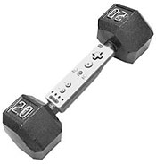
So I’m thinking: Someone should come up with a game that uses a dumbbell accessory allowing you to attach the controller to your dumbbell. The game could have several component. There could be a section that’s just a normal workout, that just gives you training advice and lets you workout along with an on-screen trainer, and it tracks your progress because it knows how many reps and sets you’re doing by tracking your movement. And there could be actual games that incorporate your workout with the game. Maybe every time you raise the dumbbell over your head, you shoot an alien. Or punch an alien. Or pick an apple. Or something like that. I’m not a game designer, but I think it’s got potential.

I wouldn’t be surprised if something like this is already in the works. Maybe I should have foregone that gym membership in favor of the much less expensive Nintendo Wii.

October 10, 2006

Marioteria

The art in this airport food court reminded me of Super Mario Brothers:

Mario Cafeteria Mario Cafeteria

Idea: College Admissions reality show

I think there could be a very interesting reality show based around college admissions. I don’t mean a reality show where people are voted off or put in contrived situations. I mean a show like “The Hill” or “Tabloid Wars” on Bravo, which were each just a few episodes long, and shot like a documentary. This program would ideally be aired during the time of year when kids are applying to college.

It would follow half a dozen high school students all applying to the same high-end (Ivy League perhaps) college. Maybe theres a kid with Straight As who seems like a sure thing to be accepted, but may not be able to afford it if she gets in. Then there’s the really smart kid who seems like he could be a straight A student, but he was so bored by high school that he didn’t get very good grades, which puts him in danger of not being accepted to college. Maybe there’s the kid who really wants to go to this school specifically, and the kid for whom this is his third choice. A good cross section of kinds of students, and kinds of people, would be best.

The series would also show the admissions board. We’d follow them as they consider each student. What do they consider? Do they weigh certain issues more than others when it comes to certain students? Do they have disagreements about any of the students? How much do those low SAT scores matter for a kid who got good grades? Just how much do those extra-curricular activities come into play? What exactly do they consider most?

Seeing inside the process would be fascinating, and learning about these kids would give viewers a more vested interest in finding out who gets in and who doesn’t.

I think I would find the show really interesting. But when I mentioned it to someone who actually works in the Reality TV industry, he said that without putting people in contrived situations, the college admission process might end up just being really boring.

Perhaps I need to re-tool the idea, then. Maybe it should be a reality show about admission to clown college. Hmm…

October 9, 2006

Idea: Approve of more than just “this message.”

Daisy - ApprovedSince Congress passed the Bipartisan Campaign Reform Act in 2002, candidates for federal office must state their approval of campaign ads. Most frequently, we hear the phrase, “I’m [candidate’s name] and I approve this message.” Sometimes, to make it less awkward, the statement is lengthened along the lines of, “I’m [candidate’s name] and I approve this message because it’s time to stop playing around in Congress, and time to start getting things done.”

Well I think an effective ad could be made that goes a step further and really embraces the “I approve this message” line as part of its campaign. It could go something like this:

“I’m John Candidate and I disapprove of the message this administration is sending the world by staying in Iraq. I disapprove of a the way the President is dealing with terrorism. And I certainly disapprove of the way Republicans are spending money with no regard as to who will pay the bills. It’s time to change the direction this country is headed. It’s time to remind the world through our actions that America is a noble country, a leader in ethics, economy, and education.

I approve of a plan to bring American kids back to school where they will recieve a top level education. I approve of getting health care where it’s needed most. I approve of helping Iraq get back on its feet and bringing our troops home. I approve of actions that send a message to the world that America is prouder, stronger, and safer than it ever has been.

I am John Candidate. And I approve this message.”

Of course, all those glittering generalities would be replaced by meaningful specifics and substance, but you get the idea.

October 7, 2006

But they already have their own chairs

Seen yesterday at Dallas Fort Worth airport:

Reserved

Yes, I know, it’s the universal sign for all sorts of various handicaps, but I still got a chuckle out of the notion that these chairs are reserved for people who pretty much bring their own chair with them wherever they go anyway. Perhaps there should be a different “handicapped” indication for those who aren’t wheelchair-bound. Maybe the same abstracted figure with a cane?

October 3, 2006

Clean up in aisle two

The gummint can be found next to the nuts and cookies in aisle two.

Gummint

As seen in Walgreen’s.