(The fourth in a series of occasional interviews with people I find interesting or who work on interesting projects.)
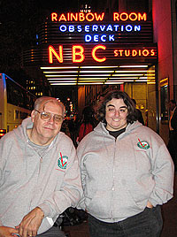
Fifteen years ago, I spent a Friday night camped out on the mezzanine level of 30 Rockefeller Center, hoping to get one of the standby tickets to Saturday Night Live that are handed out on Saturday mornings. The line forms at around 8:00 Friday night. That’s when I met Louis Klein, the SNL fan who had seen almost every episode of Saturday Night Live in person, going back to the very first episode.
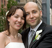
Last Friday, I decided to go back to the SNL Standby Line and see if Louis was still waiting in line to get his ticket. In the years since I camped out there, the line had moved from the warmth of the indoor mezzanine to the chill of 49th street, but Louis was still there, right behind a group of teenagers who beat him to the first spot (one of the teens asked about my website, “Ironic Sans? Does it have anything to do with Horatio Sanz?”). When Louis stands in line these days, he is accompanied by his wife Jamie, whom he met on-line around six years ago. And by “on-line” I mean on the internet, not the standby line.
I spoke with Louis about his SNL Standby hobby.
When Saturday Night Live started, nobody knew it was going to be a big hit. Why did you go to the first episode of a new show that nobody really knew?
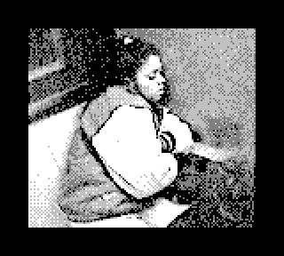
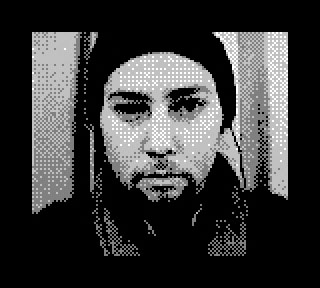
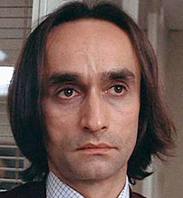
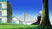
Louis Klein with his wife JamiePrior to SNL, I was going to a lot of game shows. Like, I watched the game show called Jackpot, which was done in Studio 8H prior to SNL. It ended its run in the summer of ‘75, hosted by Geoff Edwards. I was also going to the Pyramid — any one of them, whether it was 10, 20, 25, 100 thousand, 2 cents, you know, whatever it was. I went to all of them over at TV-15 which doesn’t exist anymore. Any game shows that were done here, if any, I went to them also. So I was notorious as far as NBC was concerned. They knew who I was because I went to all the shows.
Then in April of ‘75 I found out that the show SNL was coming up, so I went to the Guest Relations department and said I hear you’re doing this show. They said, Well, they want 500 people in 8H. They want to do a show that’s going to be a run through for sound purposes. We’re going to have an audience for that, and you can float around the building and find somebody who’s going to give out standby tickets. So I come over here right after work, and I found the standby ticket and I got it and I went inside and I stood in line.
I got upstairs. I saw a full fledged comedy routine by George Carlin. I saw a full fledged comedy routine by Billy Crystal. I saw performances by Janis Ian and Billy Preston. I saw comedy by the Not Ready for Prime Time Players including Jon Belushi and Gilda Radner among others. Now that’s three and a quarter hours of pure entertainment for free. And I could come back tomorrow night. And I did. And I got in a second time. I came back the following week and I didn’t get into the second show but I wasn’t going to give up at this point. This is a great thing to do on a Saturday night. I went to the third show, I got in, and in the first 5 years I’ve seen 59 out of 106 [episodes].
At what point did you realize it was turning into something you were making a regular routine?
I never really thought of it that way at that particular time. It was just something to do on a Saturday night. I just came over. If I got in, I got in. If I didn’t, I went home.
My memory from meeting you 15 years ago was that you had seen every episode live except for a few. But I guess you’ve missed more than that.
In the first 5 years I’d seen 59 out of 106. So I missed 47 shows then. To date I’ve missed I think 83. That means in the last 27 years I’ve missed 36 shows.
How many have you seen?
This is my 528th show.
The original producer, Lorne Michaels, is still with SNL. But he left the show for a few years in the middle. So is there anyone who outnumbers you in the number of shows attended?
Don Pardo. He only missed one year. It was the ‘81 season.
How come after all this time you still have to wait in the Standby Line? Why don’t they just give you season tickets?
They do. I’ve had season tickets since 1990.
But you just enjoy the Standby?
When they gave that to me, they asked me to do Standby anyway, just in case the tickets didn’t come through. So I have the standby tickets to back it up. However I never needed them, and now I just walk in. But I still do standby because I’m helping NBC out watching this, make sure people don’t jump and things like that. It helps them out. If something goes wrong they know that I’ll take care of it. And then I give the details to them later in the evening. If they have to do something about it they’ll do something.
What’s the worst thing you’ve seen go wrong while on standby?
Jumping the line, and having people join the line. That’s a no-no, because basically the people who are joining are jumping the line. Once somebody tried to get me off the line. This was for the Soundgarden and Jim Carrey episode. We were all standing inside because there was nobody out here, and then all of a sudden somebody let me know that somebody was out here and so I came out, and he was standing over by the pole over here, two guys, and I said all the standbys are inside. He said, Oh, I’m sorry. This is where the line is and I’m going to be number one and two. Well I said, No, I’m number one. He says no, we’re going to be number one. And he argued with me all night at this pole. And I was a little perturbed about it because they weren’t really nice about the whole thing. Well when they didn’t take any standbys for the dress rehearsal, these two guys nearly blew their top to NBC. They said, A standby got upstairs! So NBC checked to see if any standby tickets were upstairs, but I went up on my regular ticket. Little did they realize, I went to the party that night!
Do you get to go the after-party often?
Only the season finale, if they ask. Sometimes they do, sometimes they don’t.
When I was here 15 years ago, the line was inside. When did they move it outside?
‘93. Letterman was still here at the time, and according to what I’ve heard, somebody did damage to the building inside in the mezzanine. So Rockefeller Center said no you can’t be up here anymore, because they have to protect their tenants. And as a result all the lines were put outside. The line started at that time on this side of the building. And then NBC put it on the 50th street side because the Rainbow Room was complaining that we look like homeless people. Now we’re back on this side. We’d love to be inside the building again. They’ve got plenty of room on hand. But that’s not going to happen.
I seem to remember that 15 years ago you told me Tim Kazurinsky mentioned your name during a Weekend Update segment.
No, no. Not Weekend Update. It was in a sketch that he did. The Guru sketch. His name was Havnagootiim Vishnuuerheer [pronounced “havin’-a-good-time wish-you-were-here”]. What he was doing was he was answering Unanswered Questions of the universe. So he invited everybody in the country to write in unanswered questions that they had, and he picked one of mine, and all of a sudden I’m at dress rehearsal and he says, “Louis Klein from Ridgewood New York wants to know, does God wear Pajamas when he sleeps?”
And what was the answer?
The Guru says, “No he doesn’t. All he wears is a t-shirt. and on the t-shirt it says I created the universe and all I got out of it was this lousy t-shirt.” That was a Flip Wilson show in December ‘83.
Did they mention your name on any other episodes?
Yes, they did. And Jamie too. This was in April of 2004. Will Ferrel was the host. And he was doing the Pepper Sketch, where Will was putting pepper on Will Forte’s salad. And the character’s name was Dr. Louis something, and his wife Jamie. In honor of my 500th show.
Who was the writer that wrote you into the script?
Will Forte.
Have you seen “Studio 60” and Tina Fey’s new show “30 Rock”?
I have.
What do you think?
They’re both great.
Which do you like better?
Oh I don’t know. I love Tina. I love Tracy [Morgan], too. And I relate more to 30 Rock than I do Studio 60 because of that. But I definitely like both shows.
Do you get to know the SNL cast members?
They all know me. They all come and say Hi. I’ve met most everybody. I was invited to the 25th anniversary show, and I went to that. I had to ask for a ticket, and they said that they already have a ticket for me. I was fairly shocked.
Do you have a favorite season of SNL? Or a least favorite season?
That’s a hard question. A favorite season? You know, I don’t remember what all the hosts and musical guests are, and it’s hard. I love them all. I mean, yes, you’re going to have somebody that doesn’t do too well, especially sports figures. I mean, if you want a show that I thought the host was terrible, okay, um… uh… there was… uh… I can’t even say that. I mean, I don’t want to hurt anybody’s feelings.
Thanks, Louis! As I packed up my notes and my recorder, Louis pointed out that he would be there for several more hours if I had any further questions. And if you have any questions, I’m sure you can find Louis exactly where I did, near the front of the Standby Line outside Rockefeller Center on Friday nights.
[The preceding transcript has been edited for space and clarity].


 Whenever I’m in the 42nd Street A/C/E station, I notice that the tile number 42’s along the wall look like consecutive frames of animation depicting a jumping or sinking number. There are similar tile 59’s at the 59th Street A/C/E station. They may appear elsewhere, too.


 Back in December of 1998, a friend handed me a role of 35mm color film and asked me to take photos of anything at all, and then give the roll back for her to develop. She wouldn’t tell me why, or what she planned to do with the photos. (I eventually learned that she planned to use the images as creative inspiration for a short story project, with me as her unwitting collaborator).


 Yesterday, I


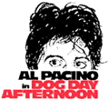 I don’t want to go too much further into what happened, because the story was turned into the excellent 1975 movie
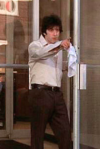


 There’s a lot of explicit sex in the movie
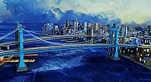


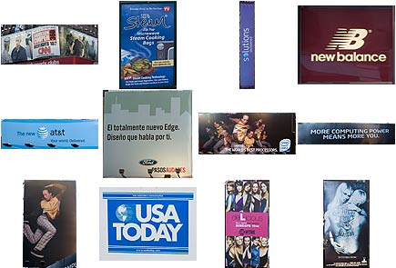
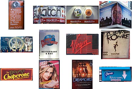
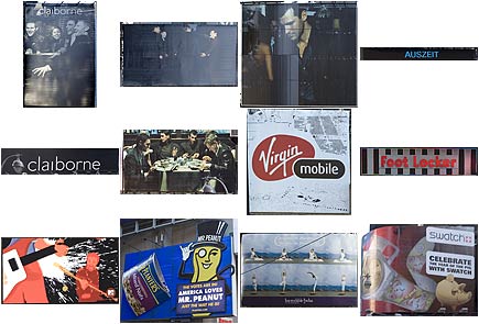
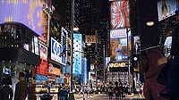
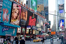 Sometimes I get dangerous thoughts in my head, like “I wonder what it would look like to see every ad in Times Square all on one page.” So when I knew I’d be passing through Times Square this weekend, I made sure I had my camera. For the purposes of this nearly purposeless project, I considered storefront signs the same as ads if they were flashy and glitzy like Times Square ads tend to be.


 My first year in New York, I lived on the top floor of an old building in Astoria, Queens, with rotted wood floors that creaked every time I took a step. I didn’t mind so much, because my schedule was so hectic I was rarely home. I got up early every day to get to my job by 9:00 a.m. I was happy to work in a photo studio, but it didn’t pay enough to survive in this town. So at 5:30 p.m. each day I left the studio and went to a bookstore across town, where I worked until 12:15 a.m. in order to make ends meet (and another 8 hours on Sundays). By the time I got back to Queens every night, hopefully before 1:30 a.m., I was beat. I’d take an hour to wind down before finally going to bed, getting a few hours sleep, and starting over.


 You know how sometimes you see a movie that’s supposed to take place in Manhattan, but in order to save money they filmed it somewhere else, like Toronto, and since you’ve been to New York you can totally tell that there’s no way they filmed that in Manhattan, except for the one scene that takes place in Times Square? Well, that’s what The Wild was like. Except, being a cartoon without location expenses and made by Disney, they really have no excuse.
 The movie is about a bunch of animals in a fictional New York Zoo who go on an adventure whose plot was ripped straight from Finding Nemo, then had all the humor and charm stripped out of it. When the animals leave the zoo to find a missing lion cub, I expected some amazing Manhattan humor before they left the city, just like in the nearly identically-themed movie
 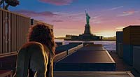 Where are the other landmarks? Where’s the sweeping skyline? No Empire State Building? No Chrysler Building? No Brooklyn Bridge? The only recognizable buildings that jumped out at me were the Citicorp Building and 17 State Street, which I think might have been partially visible in one scene. The Wild might be the first cartoon I’ve reviewed that doesn’t have a scene at Rockefeller Center. Have the animators even been to New York?


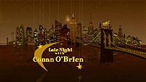 It’s hard to depict New York City in all its glory in just 30 seconds, but for the opening sequence of Late Night with Conan O’Brien, a company called


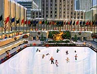
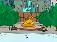
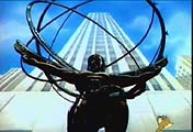
 Finally, our ride comes to an end at Rockefeller Center. Presumably, because we’re staring at the statue of Prometheus, we must be standing in the Rockefeller Plaza skating rink. But before we have a chance to catch our breath, we pan up to the highest floors of 30 Rockefeller Center, where Late Night is taped. The sequence fades out as we fade in to Conan’s entrance and opening monologue.
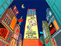
 A few weeks ago, a new animated TV series was launched called


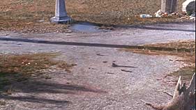
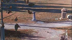
 Like most New Yorkers who were here on 9/11, my memories of that morning are with me every day, and I have already said much on the topic over the past five years. But I don’t have anything specific to write today about the anniversary of the 9/11 attacks that wouldn’t get me worked up with anger as I write it. So instead, I’ll share this photo I just took of a garbage collector named Pelé in midtown, and link to these two 9/11 related entries I’ve previously written on this site:
 In 1988, Walt Disney put out its first movie musical in 11 years, called Oliver & Company. Based on Charles Dickens’ book Oliver Twist, it told the story of an orphan kitten’s adventures in New York City.


 When the family comes to America, they go through Castle Garden, pictured at right, which was the immigrant processing station at the time. Ellis Island wouldn’t open for a few more years. Today, Castle Garden is known as Castle Clinton, and it still stands in Battery Park on the southern tip of Manhattan.
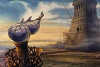


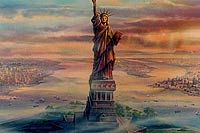
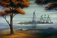 If you don’t already know, you won’t be surprised to learn that Fievel does indeed find his family at the end of the movie. This happens to coincide with Henri’s completion of the Statue of Liberty. So he picks up Fievel and his sister and flies them around for an aerial view.
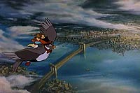
 The closing credits of An American Tail have orange-tinted pictures of old New York City in the background, with the credits over them. I was immediately reminded of
  The radio station 1010 WINS is for New York City what CNN Headline News is for cable television. It’s just nonstop headlines, weather, and traffic, repeating every 22 minutes. Their slogan is, “You give us 22 minutes, and we’ll give you the world.” Their website,
  The crown jewel of the 1010 WINS Art Collection is Peace Grannies on Trial for Times Square Protest. For
  It’s a classic struggle for every artist. How do you illustrate a
  The influence of conceptual artist
  Nearly five years after the tragic events of September 11, 2001, audio tapes were released featuring conversations between 911 operators and people trapped in the World Trade Center. For the event, the 1010 WINS artist created this commemorative work. On the day the tapes were released, a cell phone was so clearly important — a modern technological luxury but also an icon of this day in history — that it seemed like an object as large as the towers themselves. Or perhaps slightly larger, in black and white, looking a bit like it was photocopied and then faxed a few times before being scanned in for a montage.
 The ashy, veiny hand reaches out, gas pump nozzle in hand, a stream of “S”es pouring forth from its spout like precious drops of gasoline. Together, the hand and pump give off an eerie glow as Honest Abe looks onward, his gaze obstructed by an exaggerated dot screen. George Washington is barely visible, shrouded by an orange shadow of depression. The


 Am I the only person who looks at this IBM ad and sees a depiction of the World Trade Center after the first tower was hit on the morning of September 11, 2001? This explosive image that I guess is supposed to express creativity or something looks to me more like smoke and flames rising from the tower, just moments before the second tower was struck.
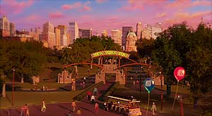
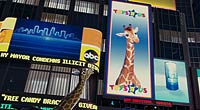
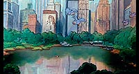
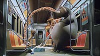
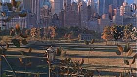
 Madagascar tells the story of a bunch of animals at the Central Park Zoo who break out hoping to live a better life on the outside. So, naturally enough, the story starts at the Central Park Zoo. It’s rendered fine enough, I guess, but it doesn’t really have much character. Nearby buildings — the Plaza Hotel, Essex House, etc — are recognizable in the background. And I guess it looks like the Central Park Zoo. But it’s so sterile and just kind of bland.

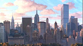
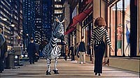 You won’t be surprised to learn that the animals escape the zoo and have an adventure in New York City. There are a couple cute moments, like the one where the zebra sees the woman wearing zebra stripes outside Saks. But for the most part, I felt the renderings of the city were a little too real-world-photogenic. I mean, this is a cartoon where all the characters have definite style. So why doesn’t the city get any style?
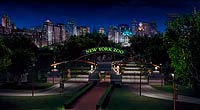
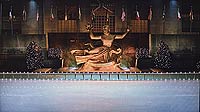 Look at Rockefeller Plaza, for example. It looks… more or less just like Rockefeller Plaza. I guess I would complain if it didn’t, but it’s just a little too clean and sterile to look good this way. It just bothers me. It’s like they’ve found the
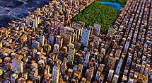
 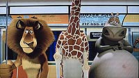 The more I think about it, the more I think the uncanny valley metaphor is exactly what’s wrong here. They created a version of New York City that’s photo-realistic and accurate in most details. But they missed the mark in so many subtle ways that it ends up being disturbing more than anything else.
 And they put benches in Grand Central Terminal. There are no benches in the main concourse of Grand Central Terminal in real life. But in the movie there are. But here’s one detail they did get right: They accurately depict the sign on the building as showing the words “Grand Central Terminal” and also accurately depict everyone in the movie referring to it as “Grand Central Station” instead.


 The Critic aired on ABC in 1994 before moving to Fox in 1995 and eventually being cancelled. But in the meantime, I enjoyed watching the adventures of Jay Sherman, movie critic and single father.
 Jay frequently spends time in the park, at restaurants, and around town in general. The attention to detail is incredible, even where it’s not necessary. In some general scenes when no specific real world location is intended, it’s amazing how the artists have captured the look and feel of the city with their brushes.


 I had the pleasure this evening of attending the opening of a new exhibit at the

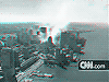
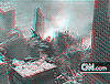
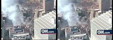
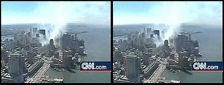
 On September 16, 2001, CNN.com


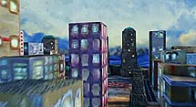
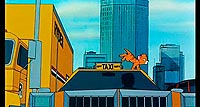
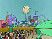
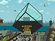
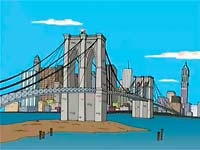
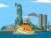
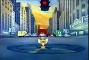
 On December 31, 1999, pizza delivery guy Philip J. Fry delivers a pizza to a cryogenics lab in Manhattan and through a series of unfortunate events is accidentally frozen for 1000 years. While he’s in deep freeze, we can see time passing visibly outside the window. We see New York City completely destroyed by aliens (except, for some reason, the building the cryogenics lab is in) and eventually rebuilt as New New York City, where Fry wakes up on New Year’s Eve, 2999.

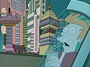

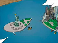
 In New New York, the subway system has been replaced with the New New York Tube System, which whisks people across town. In Fry’s first experience with the tube system, we see it snaking through the city. It goes underwater, passing a sunken Circle Line Cruise boat. It winds past the Statue of Liberty (was it recreated? or is it still standing?), which supports the tube where the torch used to be.


 It took the Simpsons nine seasons to get to New York (as chronicled in a
 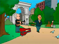 For Peter’s birthday, his son Chris gives him a painting. It’s not an especially good painting (it’s supposed to depict a “moo cow”), so Peter sticks it in the back of his car to replace a broken window. That’s where a gallery owner from SoHo in New York City spots it, and insists he can make Chris into an art star. So the Griffins pack their bags and head to New York.
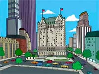 They stay at the renowned Plaza Hotel in midtown. While Chris is in the able hands of his art dealer — a rather controlling fellow named Antonio Monatti — and on the road to fame and fortune, the rest of the family goes sight-seeing on to road to, uh, downtown by way of the east side.
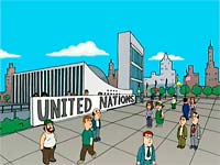 In this establishing shot of the United Nations (left), I’m not sure why the animators chose to eliminate one of the UN building’s most recognizable features — the line of flags of member nations — but the omission is forgivable as they still captured the overall look and feel of the UN, one of the Griffin’s stops on their New York City tour. I’m guessing all those flags would just be too tough to animate.
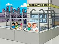 Of course the Griffin family makes a stop at one of the city’s most famous sites, the observation deck at the Empire State Building, where Peter chooses not to go agsinst his wife’s advice and drops a penny from the top. Come on, you know you’d love to do it and see what happens. Well, whatever happens in real life is surely different than what happens in the show, which is just odd enough that if I told you I’d probably be accused of making it up. So rent the DVD or wait for the rerun in syndication to find out.
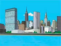 Two thirds of the way through the episode, Peter and Meg have a talk about talent. Sure, Chris is the art star, but surely there must be something Meg can do (eventually they realize that Meg’s hidden talent is her ability to do convincing bird calls). Peter sings a Broadway-worthy song to Meg about how mediocre she is, set to a montage of the two of them in a variety of New York City settings. So in honor of that song, here’s a mini-montage of other New York images from the episode:
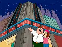
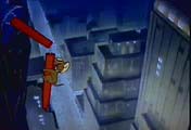
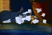
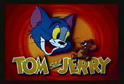 Usually, the Tom & Jerry cartoons pit cat against mouse in an animated game of, well, cat and mouse. But in the 1945 short film “Mouse in Manhattan,” Jerry has his first and only solo adventure. He goes to the city where so many others have gone on solo adventures — New York!
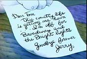 The film opens with Jerry leaving a note under a sleeping Tom’s paw, explaining that he’s leaving their boring country life for the exciting bright lights of the big city. He’s heading to New York on what’s sure to be an excellent adventure.
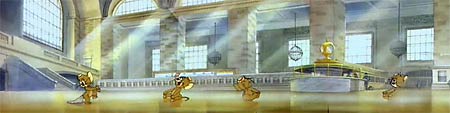


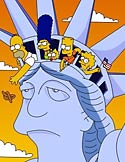 During their ninth season, The Simpsons came to New York. And many of you will never see that episode again.
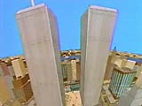 This episode first aired in 1997. At that time, the twin towers were still standing. Much of the episode takes place at the base of the towers, with some funny moments inside, also. But after the attacks of September 11, 2001, would anybody want to see this episode ever again?
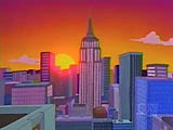 Now that several years have passed, some stations are beginning to show the episode again. A San Francisco station only showed it last year for the first time since 9/11. And according to a
  It’s too bad, too, because there are some truly funny moments in this episode. I loved Homer dancing in a field of toilets, his imagination’s depiction of what Flushing Meadows (a neighborhood in Queens) must be like. Sure, there are some neighborhoods in this town that smell like a toilet, but it’s not that bad.
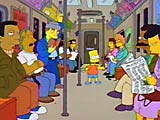 Sometimes when tourists come to New York, they avoid the subway at all costs, even when taking a taxi is the slower, more expensive way of getting around. They’re afraid they won’t be able to manage it, or they’ve heard bad things about it. But not the Simpsons. Bart even tries his hand at panhandling, before realizing that it’s best left to the experts.
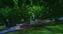
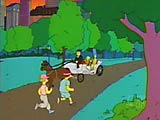 The Simpsons even manage to fit in a horse-drawn carriage ride in Central Park. I would have recommended against the carriage ride, as an overrated and overpriced experience, but I’m glad the episode manages to get the Park in there somehow.
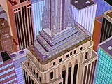 And I love this shot of the
 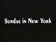 The 1983 Academy Award winner for Best Animated Short was a stop-motion claymation film called Sundae in New York directed by Jimmy Picker. It featured a then-mayor Ed Koch character singing “New York, New York” as he makes his way from scenario to scenario throughout the city meeting different people like Frank Sinatra, Rodney Dangerfield, Alfred E. Neuman, Woody Allen, the Statue of Liberty, and more.
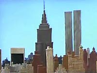 Starting with a view of the Manhattan skyline, it’s easy to see that there’s not a lot of detail. But it was 1983, and Jimmy Picker didn’t have a huge set to work with. In fact, each shot shows barely anything wider than would be possible to fit on a small tabletop set. The opening, which pans down from the skyline to Central Park, shows more background than in any other scene. In terms of scope, this is clearly no Wallace and Gromit.
 But the limited set doesn’t detract at all from the short film’s charm. The song is familiar so it hooks you right in. Even someone who isn’t familiar with New York politics will find the Ed Koch character entertaining. And the caricatures of various celebrities and personalities are usually spot on. The scenarios depict different stereotypes from New York life, so while the settings may not be expansive, the characterizations make up for it.
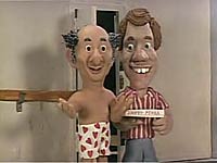 I remember back in 1983, Jimmy Picker was on a TV show (I think it might have been the Leonard Nimoy-hosted “Standby… Lights! Camera! Action!” on Nickelodeon, but I may be wrong) and he showed off the various clay characters which he stored in a normal kitchen refrigerator to keep from melting. The fact that it has stuck in my head this long shows how entertained I was by it that I remember it after all these years, diminished only by the fact that I have a sneaking suspicion my memories may have made the whole episode up.
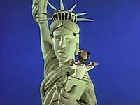 So by now you must be wondering how on Earth you can get to see this short film. Well, it was put out on a DVD called The World’s Greatest Animation several years ago, but it’s now out of print.
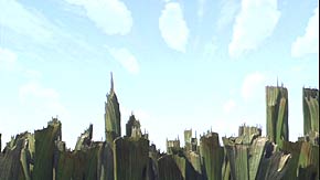
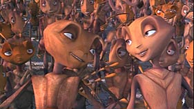
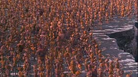
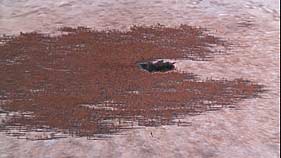
 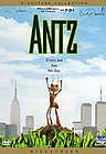 This time, we look at Antz, the computer-animated Dreamworks film about an ant named Z-4165 (called simply “Z” by the other characters) voiced by Woody Allen. Typical of Woody Allen characters, Z is depressed, in therapy, and feels pretty insignificant. This isn’t surprising, considering he’s one in a billion ants living together in a giant ant colony. It’s easy to get lost in the crowd.
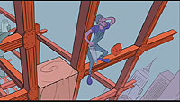
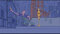
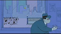
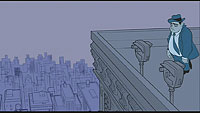
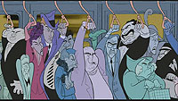
 Kicking things off: 1972’s “Fritz the Cat,” directed by Ralph Bakshi and based on the comic books by Robert Crumb.

