


How bold can Darth Vader be?

The above word-cartoon is the end result of that quote rolling around in my head for weeks. I’m not sure how successful it ended up being, but I know there’s a font pun to be made somehow with that line.
 I started out trying to literally depict that scene from Star Wars using letterforms, intending to use bold letters for Vader and light letters for Princess Leia. I loved the idea of the @ sign filling in for Leia’s hair bun. But after a few attempts I concluded that I’m no LIDA when it comes to making art from letters. I just couldn’t get the fabric to look like fabric without making the entire thing out of parentheses and tildes of various sizes. And that kind of misses the point. The letter “M” sort of did what I wanted, but not really. It’s too rigid.
Then I wondered if maybe I needed to stop trying to depict the scene from the movie, and just draw Darth Vader alone, made out of bold type. In many ways it’s the most visually striking of the attempts, but I felt like I overlapped the letterforms so much in his helmet that they were becoming mere shapes rather than letters. But here’s how that ended up:

So ultimately I decided to just use different fonts and weights to write their names (seen at the top of this post). But just floating in the frame without a sense of place, I’m not convinced that works, either. And it’s less amazing than pictures made of letters.

Comments
I have to say, Vader looks incredible. The _one_ change I would make would be to use a single, large character for the lightsaber, and not equal signs.
Posted by: Alan | May 8, 2008 12:24 PM
I rather like the top graphic. It doesn’t oversell the joke.
Posted by: the Rising Jurist | May 8, 2008 12:45 PM
Darth Vader looks great, but come on. Leia wasn’t nearly that much of a chub-o.
Posted by: Kit | May 8, 2008 1:46 PM
The Vadar is great, but until I actually read it I had no idea it was Leia. I thought it looked more like an X-Wing or Snow Speeder Pilot with their big bulbous helmets. The back part is a little Boba Fett rocketpack-esqe
But yeah, Vadar is rockin.
Posted by: Josh | May 8, 2008 4:40 PM
I think it’s hilarious. Good job.
Posted by: pete | May 8, 2008 8:12 PM
WOW! Good job!
Posted by: Dushan Hanuska | May 8, 2008 9:57 PM
Nice… I did something very similar today (typography star wars) and came home and saw this. what a trip!
http://cabin2j.blogspot.com/
if you want to check out what i did.
Posted by: Justin Crisostomo | May 9, 2008 4:08 AM
For another take on this, take a look at http://asciimation.co.nz/
Posted by: Bill Tucker | May 9, 2008 4:08 AM
I gotta say, that Vader is really badass. I agree with Kit that Leia looks too chubby, but still a good job.
Posted by: Alok | May 9, 2008 4:12 AM
Very, very nice typographic pun! I made a (sort of) response to it here.
Posted by: JohnEats | May 9, 2008 8:05 AM
☠★
Posted by: Carl Jonard | May 9, 2008 10:59 AM
Now, see, if more people spent their time doing productive and creative things like this, the world would be a far more peaceful place.
You should do seminars on this stuff.
Posted by: Miss Debater | May 10, 2008 3:27 PM
This is so cool!
Posted by: Caitlin | May 11, 2008 9:53 AM
You have until this summer to come up with a typographically punny image to go along with the launch of the BlackBerry Bold. Should be a cinch for one of your talents.
Posted by: RichM | May 12, 2008 11:08 AM
First of all, AWESOME. Secondly: Damn, someone already linked to the classic Star Wars ASCII movie. Third, I’m working on a ASCII animation framework myself at http://asciimate.com/.
Posted by: Stewart | May 13, 2008 2:09 AM
I think that the abstract approach that you ended with is the funniest/most effective. Great job!
Posted by: Caliban | May 15, 2008 4:01 PM
So… where can I buy the t-shirt? I love it!!!
Posted by: Rebecca | May 15, 2008 6:17 PM
really cool!
Posted by: Bny | May 16, 2008 2:22 AM
hah! This is good. I think your initial image works the best in terms of making the pun - the third image of vader sure is bold, but it can only be bold in comparison to something that -isnt- bold. If i could find a still of that exact scene i might offer up a better suggestion in terms of composition… but i cant. :C
Posted by: Seanic | May 16, 2008 11:34 AM
The first one doesn’t look like Leia. I actually thought it was an un-starwars character - an At-stronaut.
Posted by: Prole | May 16, 2008 12:19 PM
I really want a poster of the first, word-only version. It’s still cracking me up. The original joke is good enough, but add the physical placement of the storm troopers and Leia… man. So good.
Posted by: SideshowRalphWiggum | May 16, 2008 6:49 PM
Outstanding. I would buy the t-shirt or poster of the Vader joke in a heartbeat.
Posted by: Mike | May 16, 2008 8:53 PM
Do you have a larger size of the Darth Vader picture? I’d like to print that large on the wall of my cubicle :)
Posted by: BioNik | May 27, 2008 1:26 AM
I agree with BioNik. This would look great as a print, or as a tee shirt (as a tee I’d rather see it as white letters on a black shirt). And with a longer saber. But if you decide to make one on one of the various tee shirt sites (or if you submit it to threadless.com) please let me know ‘cause I’d love to get it. Thank you.
Posted by: mirdreams | May 27, 2008 11:32 PM
Lovely.
But wouldn’t stormtroopers use Arial?
Posted by: Michael Zed | May 30, 2008 12:21 AM
I think that the top graphic (with the characters names) is the best one. Darth made out of letters looks good, but Leia I would say is more of a “study”. Anyways, you’ve done a great job — really creative! I can’t wait to see what you tackle next! :)
Thanks for making me smile!!
Posted by: rdas7 | May 30, 2008 4:00 AM
really very good job!!! quite perfect!!! impossible not to recognize.. and so bold!!! :P congratulations! excelent!!
let me post it!! (with the correspondent credits)
Posted by: ale | June 6, 2008 12:06 AM
Just saw here another typographic Darth Vader. If you couldn’t find it — direct link to jpg
Posted by: aoeu | June 12, 2008 5:19 PM
Just saw another typographic Darth Vader here — http://www.drawergeeks.com/showTopic.php?id=60. If you couldn’t find it — http://www.drawergeeks.com/images/topic/topic60/28_Marxmith.jpg —direct link to jpg.
Posted by: aoeu | June 12, 2008 5:34 PM
“how bold can vader be?” is hilarious.
but in the land of george lucas and the STAR WARS universe, “stormtrooper” is one word, not two. just the nerdy copyeditor in me nitpicking….
Posted by: jody! | June 18, 2008 12:48 PM
wow. so nerdy. like embaressingly so.
BUT absolutely incredible at the same time.
well done.
Posted by: Brigitta | June 27, 2008 4:02 AM
If you like these kind of type pictures, take a look at my student’s work.
Typographic portraits.
http://picasaweb.google.com/wolkouno/TypeFaces
Posted by: Joolz | July 23, 2008 12:50 PM
While your typographic art hits it out of the park generally speaking, the “word cartoon” at the top is sheer minimalist genius. Each pair of words is the utter essence of the character and just makes the joke so brilliant.
Well played, sir, well played. And darn you; wish I’d of thought of that!
Posted by: Samuel John Klein | October 3, 2008 1:00 PM
You gotta make that top one a shirt some day.
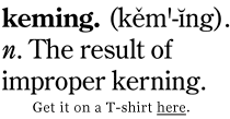
It would go great with my ‘Keming’ shirt.
Posted by: Endocrom | October 9, 2008 3:55 AM
I agree with Endocrom… with some tweaking these could make a great t-shirt.
Posted by: Dave - Star Wars font | February 3, 2009 10:40 AM
I thought I’d give it a shot and see if you would respond to me. I’m really impressed with your artwork and I was wondering if you would consider submitting some designs on our new startup. It’s called tfuse.com and we use t-shirt designs and video to promote different artist.
Our design process is similar to a few of the other online t-shirt design companies you’ve seen out there. For selected designs we are offering $200 up front with a chance to earn an extra $2,300 in royalties (you get $1 per shirt sold). We only have a few artists on the site so you chances of winning are high. Our main goal is to get better art and I thought you’d be perfect. Let me know if you would consider submitting or if you have any questions about the site.
Thanks,
David
Posted by: David | March 7, 2009 2:02 PM
.. ..
’ ’ ’ ‘
’ ’ ‘
’ ‘
’ ‘
’ x. love is a speshal thing
Posted by: ashley | April 23, 2009 3:06 PM
Gosh this is awesome.
Ilaria
Posted by: Ilaria | June 22, 2009 12:49 PM
I “Stumbled Upon” your site and I love it!
The bold darth vader is great! I have a degree in graphic design, I agree about the sword maybe an upside down T would look better, still awesome site.
Posted by: Jasmine | June 22, 2009 7:46 PM
Woow.. Really Cool!
Posted by: habil Bozali | August 13, 2010 3:00 AM
and another http://www.fastcodesign.com/1662713/nerdgasm-star-wars-drawings-made-only-with-type
Posted by: Chris | November 17, 2010 6:17 PM
These are pretty good! The quote is my favourite :)
Posted by: Jodi | February 7, 2011 3:29 PM
I am an interior designer who has a client who I think these graphics would be great to get a print of and frame. Are these available as prints? How much? What size?
Thanks so much!
Posted by: Amanda | October 4, 2011 9:36 AM
they stole ur design and are selling it as tshirts http://www.redbubble.com/people/pkliatsos/t-shirts/7962327-darth-vader?c=108264-starwars
Posted by: typogril | October 28, 2011 7:02 AM