In early 2008, I coined the term keming, defining it as “the result of improper kerning.”

It’s a nerdy graphic design joke, and it became one of my more popular posts. Readers suggested that I create some keming merchandise. So I did. The t-shirts are the most popular items, but my favorites are the mug and spiral notebook (both of which make excellent stocking stuffers).
I began to dream that the word would be widely adopted and become an actual part of graphic design language. How awesome would it be to coin a word that people actually use?
Well, it turns out that the word has caught on in some circles, and has become common enough that it’s somewhat disassociated with me. I occasionally meet people surprised to discover that I coined it. Well, if you weren’t reading this blog four years ago, I guess you wouldn’t know. So I thought I’d reconnect with the word in a follow-up post examining some of the places I’ve seen it used.
A Design Reference Book
 In 2009, Armin Vit and Bryony Gomez-Palacio of the design firm UnderConsideration published a comprehensive reference book on all things design.
It’s called Graphic Design, Referenced: A Visual Guide to the Language, Applications, and History of Graphic Design and it has nothing but 5-star reviews on Amazon. It looks like a pretty nice book. You can see details and sample spreads on their site where they call it “a comprehensive source of information and inspiration by documenting and chronicling the scope of contemporary graphic design, stemming from the middle of the twentieth century to today.”
They reference keming on page 74:

Here’s a detail of the page:

Urban Dictionary
Urban Dictionary, the online resource for made up words, has an entry for keming where three people have submitted examples of the word used in a sentence. They are:
What the helvetica, your kerning has turned into one massive keming fest. What the font were you thinking?
The typographer who worked on that film just pulled a keming by not having equal spacing between each letter in each word in the opening credits.
I ’ mtryingtosetspacing, butIcan ’ tseemtogetthekemingright.
I’m not sure I would say that someone “pulled a keming” but maybe that’s a regional use.
A Whole Blog About Keming
Earlier this year, a designer in the Netherlands named Kilian Valkhof started a tumblr called Fuck Yeah Keming, “a celebration of horrendous kerning all over the internet.” He has some good examples. Check it out.
Reddit
My old posts don’t usually get that much traffic, but the original keming post still gets hits on a regular basis from one site in particular: reddit.
Redditors have taken a liking to keming, and it comes up often in the comments. Usually the submitted article features some sort of keming, which prompts someone in the comments to say “Nice keming there.” Then someone replies, “WTF is keming?” And then someone else replies with a link to my site.
Update: There’s now a keming subreddit.
So, thanks for keeping keming alive, redditors!
Wikipedia
It appears that on three occasions, different people (not me) created Wikipedia pages for keming. All three were later deleted. According to the Wikipedia deletion log the reasons were as follows.
The first time: “Not enough context to identify subject”
The second time: “Patent nonsense, meaningless, or incomprehensible: db|WP is not a dictionary”
The third time: The page was set up to redirect to the entry for kerning, but was deleted after discussion decided that “‘Keming’ is a joke word invented by David Friedman… When the redirect was created the target article referred to the joke, but it’s since been removed due to lack of coverage in any reliable source so the redirect doesn’t serve much purpose any more.”
Indeed, the wikipedia page for kerning has had references to keming written in (not by me) and deleted over the years. According to the revision history, the reference was changed to clarify that “keming is not what ‘improper kerning is called’; it’s a joke” and then removed completely because “the Ironic Sans blog does not appear to be an authoritative source.”
Who, I ask, is a more authoritative source on a word that I made up than me?
Currently, the Wikipedia entry for keming is a disambiguation page, which says “Keming may be… A satirical misspelling of kerning, referring to bad kerning which causes the letter pair ‘rn’ to appear as ‘m’”
If you have to explain it…
Other People’s Products
I occasionally hear from people telling me that they saw keming on someone else’s merchandise. Sometimes people just take my definition and put it on a shirt. That bothers me. But sometimes people come up with other clever uses for keming in joke form. My favorite is the Leam to kem shirt by Able Parris.
What else?
Do you use keming to mean improper kerning? Do you ever see or hear anyone else use it? Where else is it being used that I’ve overlooked?
A note about coining this word.
When I wrote the keming post, I first did a Google search to see whether or not the joke had been done before. All I found were a couple references to people with the name Keming, and other proper nouns (a school called Keming, for example). But it was hard to search because the vast majority of results were actual cases of keming the word kerning! A search result would contain the word “keming” but clicking through to the page would show an article about typography scanned in from a book or magazine and put through OCR. Every instance of the word “kerning” turned up as “keming” in Google. Here’s a typical example.
UPDATE: Here’s another great usage. A reader just wrote to tell me that he named his whole company after keming. It’s a technical design studio called Keming Labs. He says, “I really like the term and I ended up using it in my company name (I hope you don’t mind). We do data visualization stuff on the web, and ‘Keming Labs’ sounds serious enough when we meet with clients. It’s easy to tell clients who get the joke though, because they usually chuckle immediately.”
UPDATE 2: This is perhaps the most awesome keming update ever. I’ve known for a while that Google has a hidden joke in their search engine where, if you search for the word kerning you’ll see the word appear in the search results with too much space between each letter. But it was recently brought to my attention that a Google search for keming has the opposite joke. Everywhere the word appears in the search result listing, the letters are spaced too close together!
@ironicsans Did you see Google’s special formatting for “kerning” and “keming” searches? You changed Google.
— Andy Baio (@waxpancake)
June 7, 2012


 Is there an upper limit to the amount of money you can raise on


 This could damage your gadget, so there is a feature in the Outlet 2.0 standard that prevents this from happening. It is not shown in the plug renderings above because I haven’t worked out the details yet. It will probably take the form of an extra prong that doesn’t carry electricity, placed off center so as not to be confused with the grounding prong already present on current “three-prong” plugs. At right is a rendering of how it may appear. This not only prevents you from sticking a 2.0 plug in a 1.0 outlet, but makes the different outlets easy to recognize by sight.
 I started out trying to literally depict that scene from Star Wars using letterforms, intending to use bold letters for Vader and light letters for Princess Leia. I loved the idea of the @ sign filling in for Leia’s hair bun. But after a few attempts I concluded that I’m no
 Someone who manufactures pots and pans should make a matching set of measuring cups that look just like the pots they make but smaller. And with some creative design tweaks, teaspoons and tablespoons could be made that look like tiny frying pans.


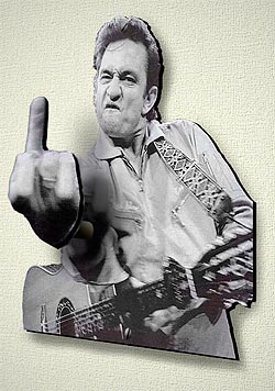 I think a kitchy home accessories designer should license historic photos of celebrities giving the middle finger and turn them into 3-dimensional coat hooks. At right is an artist’s rendition of how such a coat hook might look using a famous photo of Johnny Cash.
  The Tim Burton movie


 So how about making a Digital Jewel Box? Here’s how it would work: The DJB sits next to your stereo or computer in its charging dock. Similar to a digital picture frame, it syncs wirelessly to your home network via WiFi, syncing itself with iTunes or whatever digital player you use. When a new song comes on, the DJB’s screen shows the album cover art for that song.
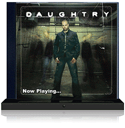
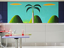
 A new mall called The Domain opened this weekend in Austin. The bizarre photo at right has been chosen to represent the mall in advertisements, brochures, and directories. Seriously, this might be one of the strangest photos I’ve seen used for something commercial. Or at all.
 Hi hi hi there, droogs. This weekend, oh my brothers, I, your humble blogger and narrator, had a thought in my rasoodock to create this orange clockwork. Viddy well this malenky clock which you can hang in your domy for just a little pretty polly. Perhaps your pee and em, or some other veck or soomka you know would find this clock real horrorshow.
 It would probably be weird to have them as part of a font set, but maybe it would look neat used for a pull quote in an article about comic books. It seems like every three years or so there’s another article about how graphic novels are finally getting respect as literature, so maybe the next time one of those pieces runs they can try out my idea.


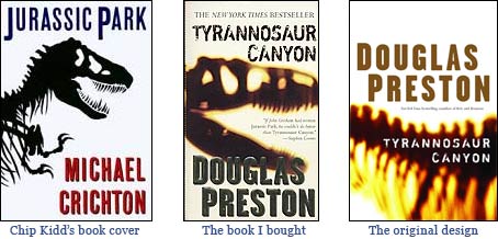
 I know, I’m not supposed to judge a book by its cover. But that’s why the cover is there, right? It’s supposed to give me some sense of what the inside will be like. So when I found myself needing something to read on a recent flight, I picked up a book that jumped out at me in the airport terminal bookstore: Tyrannosaur Canyon by Douglas Preston. I remember being terrified by his brother Richard Preston’s non-fiction book
  Let’s start with the cover, designed by Howard Grossman of
  Designed by John Baldessari, the museum space is transformed into a surreal experience worthy of the artwork it contains. The floor is a carpeted Magritte-esque sky. The ceiling is covered with images of freeways. The guards all wear suits and bowlers, like they’ve stepped out of a Magritte painting. The entrance to the exhibit is a larger-than-life replica of Magritte’s painting
  Also, LACMA needs to check their cash registers. When I made a purchase, I received a receipt with the name of the museum misspelled. How long has it been like that? Someone should be paying more attention to detail.


 How does it work? It begins with a thick layer of glass or clear plastic. This protects you from the ants, and protects the ants from you. Below the glass is an open space with a thick layer of dirt, allowing the ants to crawl in, out, and around their tunnels, caves, and hills. This all rests on top of a sturdy base layer, which doubles as the bottom of the desktop. Small holes around the sides of the desk provide air, while being too small for the ants to escape.
 Recently announced in partnership with CafePress.com, New Line Cinema is encouraging anyone and everyone to become an official licensee of merchandise for the upcoming movie Snakes on a Plane (which, if you haven’t heard by now, promises to be exactly the sort of movie you think it will be based on that title). Most of the movie’s buzz has already come from
 Each “-ist” website has its own cute logo following the same theme: a few sillhouettes of buildings, other architecture or landmarks, followed by “citynameist.” Each one also features a different colorful background. The original Gothamist logo, above, was designed by Sam Park, of


 Am I the only person who looks at this IBM ad and sees a depiction of the World Trade Center after the first tower was hit on the morning of September 11, 2001? This explosive image that I guess is supposed to express creativity or something looks to me more like smoke and flames rising from the tower, just moments before the second tower was struck.


 This weekend I saw a poster advertising the new Coca-Cola Blak, some sort of Coke-and-Coffee hybrid.
 I had the pleasure this evening of attending the opening of a new exhibit at the

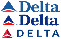
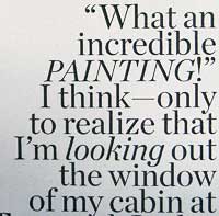 I flew Delta this weekend, and found myself LOOKING through their in-flight magazine while waiting to take off. I noticed something in their magazine that I’ve noticed before — they randomly ITALICIZE things for no apparent reason. And sometimes they use all-caps for no apparent REASON.
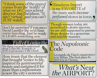

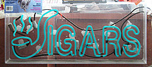
 I saw this banner outside a museum last week, and I had to take a picture. I haven’t seen such a confusing use of type is a long time.