


New Delta ad campaign an in-joke for nerds?
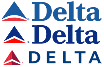
Changes in Delta*Earlier this month, Delta launched a new ad campaign called “Change,” along with a new logo. Even before the launch, I’d found myself recently appreciating the logo for features I’d never noticed before. Somehow it had never dawned on me that, in addition to being an abstraction of an airplane’s wings, the actual shape of the logo is a triangle — the Greek letter Delta. Maybe it’s not as brilliant as the FedEx arrow but I like it.
The new red version of the logo has been promoted with a new ad campaign by SS & K. The campaign highlights all the changes recently made at Delta. The ads say things like “CHANGE IS: TXTING U UR FLT STATUS” or “CHANGE IS: NEVER BEING BORED ON BOARD.” I saw one ad that summed up the campaign’s theme as simply “CHANGE IS: DELTA.”
And that’s when I realized: Delta really is change. In physics, the Greek letter Delta is used to indicate change. For example, a simple formula for calculating a change in velocity might look like this (taken from this article about deltas in physics):
![]()
This would be read as, “The change in velocity is equal to the second velocity measurement minus the first velocity measurement.”
So is this an intentional double entendre meant to be appreciated by science and math nerds only? Or is it just serendipitous that Delta really does mean change, and that happens to be the word they based their campaign around? I’m not sure. But I appreciate it either way.
* I almost captioned this image “Can I help ya help ya help ya?” but thought it might be too obscure.

Comments
“Can I help ya help ya help ya” was the first thing I thought of when I saw the three delta logos :)
Posted by: Brian Scates | May 29, 2007 10:34 AM
I like the ad campaign/nerd shoutout/new logo, but I’ve got to say—I wish these huge companies would stop changing their logo fonts to sans serif just to seem “shizzle.” I guess I should be glad they didn’t de-capitalize and rename it “deltr” or something, though.
Posted by: Jake | May 29, 2007 11:14 AM
I almost captioned this image “Can I help ya help ya help ya?” but thought it might be too obscure.
Always go with your first instincts, my friend!
Posted by: Steve | May 29, 2007 2:22 PM
I too was expecting a “Can I help ya help ya help ya” caption.
Posted by: Othemts | May 29, 2007 3:49 PM
You know, I was looking at these ads on the subway just last week and wondering if I should do a little joking linguistic analysis post of my own. Luckily you saved me the effort!
But I highly doubt it’s a serendipitous coincidence—delta isn’t really reserved for serious math/science nerds (at least not in my admittedly nerdy mind). I think we used delta as a symbol even in high school chem and I’ve used it as shorthand when taking notes ever since (and I’m an English-major-turned-web-geek, not really too much for the science, though I tried).
Besides, if you named a company “delta” and used a triangle in your logo, you gotta know the terminology. Maybe it’s just an in-joke for dorks who like symbols. :)
Posted by: lauren | May 29, 2007 6:56 PM
Delta is named after the Mississippi Delta where the airline started. Don’t ask me why I know that.
Posted by: yellojkt | May 29, 2007 10:38 PM
That new logo is waaaaay too close to the Citgo logo. I smell a law suit.
Posted by: JET | June 4, 2007 5:40 PM
I would have laughed at the caption.
Posted by: Lady Strathconn | June 10, 2007 8:51 AM
Physics nerd here - love the “Change is: Delta” slogan. Will have to remember that one on my next exam!
Posted by: Rissa | June 11, 2007 11:25 AM
Definitely not a math/science nerd, but I got the play on words right away. It made me smile…
Posted by: Nina | June 26, 2007 1:49 PM
Are you guys kidding me? This new Delta campaign amounts to about 30 seconds of thought. I am saddened by how easily you are impressed.
Posted by: Ash Progosam | July 13, 2007 8:08 AM
That new logo is waaaaay too close to the Citgo logo. I smell a law suit.
Posted by: video conferencing | September 3, 2007 5:46 AM
Just as an FYI - the logo likeness to the greek leter delta is correct and prurposeful.
A little history. Delta Airlines was started in the Mississippi delta. That was the original home - hince the name. Also a delta (the land mark) looks like the greek symbol. The logo was done in the beginning to reflect this - the color variation and new streamling is what makes it more obvious now.
Posted by: lcflowers | September 16, 2007 12:44 PM
qnxf ysfbr zapoecmbl mxvrpw jncg owum clib http://www.pfrwtkzl.tcovksw.com
Posted by: bnrmxwsci sdyog | September 27, 2007 12:35 PM
I saw the “Change is: Delta” ad on the subway and laughed aloud. I wrote about it too, but you were way ahead of me. I think it was probably accidental, but I love the idea of an old math/science nerd turned advertiser coming up with this idea and trying to sell it to the Delta heads…
Posted by: Fortasse | November 29, 2007 1:27 PM
funny, I never noticed it was an airplane wing, I always saw it as the greek letter/symbol :-)
Posted by: Spin | August 5, 2008 12:20 AM
There is a post here that more clearly explains the logo and how narrow minded the “artists” were that developed it in concert with the Delta Nortwest Airlines merger.
http://telstarlogistics.typepad.com/telstarlogistics/2007/05/musings_on_the_.html
Posted by: a2 | December 14, 2008 6:58 PM