


Terrorism makes this ad special
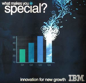 Am I the only person who looks at this IBM ad and sees a depiction of the World Trade Center after the first tower was hit on the morning of September 11, 2001? This explosive image that I guess is supposed to express creativity or something looks to me more like smoke and flames rising from the tower, just moments before the second tower was struck.
Is it as blatantly obvious as I think it is? Or is it just that I made the association because I saw this ad displayed poster-size and back-lit at my departing gate at the airport?
Update: Wow. Judging by the almost 50 comments so far today, I guess this isn’t going to go down in history as my most successful post ever. Fark.com sent lots of people my way, and some Farkers can sure be vicious in the comments (welcome to my site, Fark readers — I hope you explore the rest of it while you’re here). Just to be clear, I’m not someone who sees 9/11 imagery everywhere I look (or faces on Mars, etc). And I certainly wasn’t offended by the ad. I too am bothered by people who confuse simply being reminded of a tragedy with actually being offended by whatever triggered that memory. I just thought this particular ad looked so obviously like the twin towers to me that its placement at the airport of all places could have been thought out a bit better. But people see all sorts of things in different ways, and I guess I’m not in the majority with this one. At any rate, you can read on in the comments to see lots and lots of people who disagree with me, and a few who agree. But be warned: Some of the less mature Farkers’ responses may not be suitable for (but perhaps were written by) young children.

Comments
My initial reaction was that it looked like smokestacks at a factory.
Posted by: SBG | July 6, 2006 1:38 AM
i didn’t really see it until you pointed it out, but now i can’t look at it any other way.
i thought it was kind of cute at first, now i think it’s a bit weird.
Posted by: EmmaGiselle | July 6, 2006 8:56 AM
It’s a frickin add for business services.. who cares?
Posted by: farker | July 6, 2006 10:25 AM
You have way too much time on your hands, or possibly just read into things a little bit too far. I’m not sure if you remember correctly, but to the best of my knowledge the plane didn’t hit the roof of the tower.
It’s an ad. A good one, at that. STFW and GBTW.
Posted by: TOTALfarker | July 6, 2006 10:33 AM
I see a cig
Posted by: Some Guy | July 6, 2006 10:49 AM
Money shot.
That is all.
Posted by: UltraFarker | July 6, 2006 11:06 AM
Your just an idiot, did you also fold a $20 american bill and see the pentagon on fire and claim conspiracy?
Posted by: Al | July 6, 2006 11:30 AM
A guy wrote into our local paper saying the same thing about a Cingular ad…
Get over it. You can see whatever you want to see, but it’s a stretch.
Posted by: Ryan | July 6, 2006 11:43 AM
Yes you are the only person…how’s the new tinfoil hat?
I see a retarded ad.
Posted by: Heywood J. | July 6, 2006 11:44 AM
Yep, definitely a money shot. But maybe I’m just immature.
Posted by: Ryan | July 6, 2006 11:44 AM
It looks like love. And clouds.
Posted by: Kramer | July 6, 2006 11:48 AM
Oh my f**king god get over it.
Posted by: Tom Parker | July 6, 2006 11:48 AM
Wow, you people are vicious! I guess that’s what happens when you’re linked to from Fark. I guess this won’t go down as my most popular post ever.
I don’t see things like this everywhere I look, like some people do. But I was at the airport and this looked a lot like the twin towers to me. I wasn’t offended by it, but thought it could have been thought out better.
Okay, you can go back to flaming me now.
-David
Posted by: David | July 6, 2006 11:52 AM
It’s like those starbucks ads. The ones with the dragonflies or whatever flying towards drinks.
They’re drinks and bugs. That’s it.
Sheesh.
Posted by: jgarfink | July 6, 2006 11:52 AM
Umm no I dont see the twin towers, sorry.
Posted by: Mike | July 6, 2006 11:54 AM
I blame Clinton for failing to handle this the first time.
Posted by: Mike Hunt | July 6, 2006 12:03 PM
I see a design that borrows elegant forms from 60’s style concert posters and an organic visual analogy to growth in the supposed companies 4th quarter. What I don’t see is TWC/9/11, maybe if I was at the airport in NYC after visiting ground zero I might make that association but even thats a far stretch.
cheers,
P.
Posted by: Paul Sveda | July 6, 2006 12:09 PM
I see what you saw and saw it immediately.
Posted by: Jennifer | July 6, 2006 12:18 PM
No. It really doesn’t. Must be you in your mindspace. Understandable, but I really think it’s a stretch.
Posted by: Brent | July 6, 2006 12:36 PM
Yep. I saw a tower on fire even before I saw the headline.
Posted by: ZB | July 6, 2006 12:38 PM
Yes, it is just you.
Posted by: Trever Fischer | July 6, 2006 12:42 PM
I didn’t immediately think it was the WTC, but if I saw it at the departure gate at an airport, I’d probably make the connection.
I think it’s an acceptable ad in general, but in that context it’s inappropriate.
Posted by: Brent P. Newhall | July 6, 2006 12:51 PM
Why don’t you go ahead and say its offensive because its racist. Yes, I think you are being that dumb.
Posted by: Joe | July 6, 2006 12:53 PM
OMFG Dat’s raaaysist!
Posted by: Blaqpowa | July 6, 2006 12:56 PM
It looks like a growing erection that results in an orgasm to me…
Posted by: someone | July 6, 2006 1:05 PM
i think your right it does look like the wtc and ive seen this ad before on my departure and i was paranoid the entire flight
Posted by: kody | July 6, 2006 1:30 PM
I saw it even before reading the article you wrote. The flowers coming off the tress look a lot like burning ash…
Posted by: Banana | July 6, 2006 1:31 PM
I see it as, 4th quarter profits is up, in new and exponential ways. Others see it as what is being constantly thrown in the face of all americans. I think we are just being a little too paranoid.
Posted by: Tim | July 6, 2006 1:44 PM
It’s just a wang
Posted by: Anonymous | July 6, 2006 2:16 PM
I saw a roman candle.
Haha I hope you let it roll over as a quick odd moment in life. Fark is a bag of hateful elitists.
\orly
\yarlly
\\you’ve been slashed
Posted by: icstepec | July 6, 2006 2:22 PM
I think the ad absolutely conjures up images of the towers, and the “new growth” in the copy will obviously rise from the ashes of the old. It’s simply in poor taste. Perhaps asking “Is it just me?” is pointless. Your own insight is valid (no one can argue with how you interpret art), and it doesn’t matter what anyone else flippantly thinks.
Posted by: Craig | July 6, 2006 3:13 PM
I saw a turtle.
Posted by: Yertle | July 6, 2006 3:27 PM
Dude — way over reaction here — have you ever made a graph of revenues from MS Excel?….the bar chart is pretty flat…somebody just used some formatting and added a pretty design that they noticed when they gagged on the BONG!!!
(i.e. that is what I think it looks like)
And, hey Tim, ya you up above who points out that 4th quarter profits are up in “exponential ways”…if you count the wasted bong hit - ya they’re up — if not…it is flat at best…
Posted by: poster bunny | July 6, 2006 3:32 PM
People, people, the contraction for “you are” is “you’re.”
Posted by: rs | July 6, 2006 4:13 PM
It’s just a metaphor for the Globalist Corporate System… burning down (figuratively) our once beautiful planet, and leaving us with the one dimensional drab future of Slavery that they desire for us.
be happy
the Ministry of Homeland Security will be watching over you.
War is Peace
Freedom is Slavery
rejoice comrades.
Posted by: uh clem | July 6, 2006 4:28 PM
I read your post before looking at it, and at first glance, I DID see the WTC. The more I look at it though, the less and less it really looks like the WTC.
Posted by: dgenerate | July 6, 2006 4:38 PM
THE TRADE CENTERS WERE BOMBED, AFTER THE PLANES HIT THEM… SO, IT DOESN’T MATTER.
Posted by: DW | July 6, 2006 4:59 PM
Give the guy a break for having an over-active imagination… It kind of looks like the WTC to me too, but obviously it isn’t really supposed to. Look at this page and read how he got the idea for the blogpage name.. the guy is creative, not crazy.
Well, maybe he is crazy, has anyone checked his basement for jars of human waste?
Posted by: ninja massacre | July 6, 2006 5:43 PM
…come to think of it - does anyone think there is a conspiracy with the name “IBM”? any one think the letters stand for anything? No?
Go up to your boss tomorrow and simply say “IBM” and walk away, add a swagger to your walk and you get a free day off, or lunch is on me!
Posted by: ninja massacre | July 6, 2006 5:47 PM
My first reaction was that I thought it was the results of an atom smasher. The ad’s pretty small tho. Hard to tell what it’s supposed to be. But frankly, WTF would IBM have to gain by reminding people of a national tragedy, while trying to sell them something? Or, are bar graphs now verboten in print media cuz some oversensitive nut sees WTC buildings in every vertical line they see? I hope not.
Come to think of it, that ad looks like it could be from the 80’s…
Posted by: Guy | July 6, 2006 7:19 PM
IBM = International Business Machines, or at least it used to
Posted by: Billy | July 6, 2006 7:41 PM
Its a graph chart wtf
Posted by: Anonymous | July 6, 2006 7:51 PM
Looks like tacky gay vectorized graphics that got popular early 2000
Posted by: Jimmy | July 6, 2006 8:33 PM
Ta ta ta ta ta ta ta ta ta too much time on your hands…
Umm, I see a bar graph with the final bar drawn by a flamin’ fruitcake.
Posted by: Timmy | July 6, 2006 10:05 PM
Wow. Some people can be such jerks? Are you still living with your parents? Can you not see that this he got a bit unnerved to see this while about to get onto an airplane?
Anyways, it does look a little too much like the 9/11 tragedy anyways. Accidental or not, it is in bad taste to have it near departure gates in airports. You would think that possibly the marketing people would have caught that before going public with it.
Posted by: Lighting Jim | July 7, 2006 12:52 AM
Oh, and the “tin foil hat” thing is a really intellegent way to talk.
Posted by: Lightning Jim | July 7, 2006 12:53 AM
One man’s flame is another man’s meat. I guess the Ad agency that did it is trying some psycho programming. Its probably a CIA sponsored ad too….Paranoia is infectious
Posted by: colbert | July 7, 2006 3:08 AM
I see 4 cigarettes. Two of them are new, two are various sized butts. One of the new ones is being lit and smoked by a very lucky individual who can still smoke…Oh man, I wanna cigarette. Bad.
Sounds like your feelings were kinda hurt by various anonymous internet posters. This is a big mistake. Don’t ever let ‘em see you sweat, kid. And don’t ever, ever, ever, apologize. Especially to women.
Posted by: Another hateful elitist Farker | July 7, 2006 3:16 AM
David,
First, thank you for inadvertently reminding me why I don’t read fark or associate with anyone who does if I can help it. Especially those who would (without noting the irony) waste their time telling you (in a barely legible fashion) that you are wasting your time.
I mean, what nerve do you hit there? You saw an “elephant-shaped cloud”, so to speak, and they all jumped down your throat. Well, they’ll be gone soon enough and I’ll still be a reader of your stuff when that happy day occurs.
{ k }
Posted by: Koos | July 7, 2006 10:35 AM
Wow, it’s depressing how many of these hyper-aggressive, semi-literate 12-year-olds didn’t even understand the meaning of David’d post. He wasn’t claiming conspiracy, he was claiming that IBM and/or their chosen ad agency pulled a boner. Even if you don’t agree with David’s perception of the ad, clearly a lot of people do, me included.
(but hey, why don’t you write another “Yes, it’s just you” post anyway. Those are awesome.)
So the bottom line is: unless IBM wanted potential customers to think of 9/11, the ad is a failure. Which is too bad, because I kind of like the design.
Posted by: Adam | July 7, 2006 11:38 AM
Here via Wired, and, yes, I saw the Towers immediately, even before I read your headline. Any ad that conjures up such a negative association with so many folks is a poor one.
Posted by: Synonymous | July 7, 2006 4:36 PM
You´re right, at first glance the WTC is there.
Wicked I say
Posted by: Mikah | July 8, 2006 2:05 PM
LOOKS LIKE A FRIGGIN BONG TO ME HOMIES.
Posted by: jabibbbble | July 8, 2006 5:10 PM
I saw this same thing in the smoke shop… A few bongs for sale and the guy behind the counter doing a demonstration….And, uh, no, of course I’ve never smoked any pot.
Posted by: poopytheclown | July 9, 2006 1:20 AM
I like to put gerbals in my butt.WoooooooooooooooooooHooooooooooooooooooooooo!!!!!!!!11111111oneoneone
Posted by: George Bush | July 9, 2006 12:08 PM
Are you serious? You trying to say that ad looks like the WTC’s is about as bad as hollywood already trying to make money off 9/11. Get a grip, there is no WTC, just a bar graph stating strong company innovation and growth……….
Posted by: bleh | July 10, 2006 3:26 PM
I didn’t pick it up till you mentioned it, but now I really see it. As for the Farkers who blast you, Fark ‘em. Keep up the good work!
Posted by: Steve | July 10, 2006 5:13 PM
It’s ok David some people are just A-holes. I can see why you think it looks 911’ish though.
Posted by: Michael | July 12, 2006 6:52 PM
It’s ok David some people are just A-holes. I can see why you think it looks 911’ish though.
Posted by: Michael | July 12, 2006 6:52 PM
I totally agree, and within seconds it reminded me of this: http://www.lowculture.com/archives/2004/11/low_culture_exc_2.html
That was the best picture I could find…I saw it on a highway in New Jersey numerous times and thought it wildly inappropriate
Posted by: Hannah | July 19, 2006 10:45 AM
i think you’re right, it is pretty reminiscent. i don’t think it’s oversensitive to think that madison avenue probably could do better with their money than remind people of something pretty upsetting — not ‘cause it’s offensive, but ‘cause it’s bad business.
Posted by: kate | July 27, 2006 10:28 AM
Most of these comments are absolutely ridiculous (except that the ad looks like love … cuz it does … sweet, tender love) … other than that: don’t clutter this fine blog with worthless sludge!
And, jesus christ, how many stoners have absolutely nothing to do with their time? Go play a video game or beat off you worthless bastid’s!
Posted by: Orlando | August 8, 2006 3:25 AM
Cool site. Thanks!
http://adult-personals.group-love.com/ adult personals
Posted by: adult personals | August 8, 2006 10:57 AM
Advertising is a form of art. It means different things to different people.
You are narrow minded fools who sit on the internet critisising other peoples interpretations.
I didn’t see 9/11 in that pic, but now that it has been suggested it looks a hell of a lot like the two towers.
even though the tower’s roof didnt get his by the plane, that pic looks a hell of a lot like the towers burning(smoke rising up…)
I’ve worked in advertising(DTP) for 5 years and you would be surprised what subliminal imagery is added to things to make it stick with people.
I’m not screaming conspiracy theory, but it is far from impossible that the artist is using imagery from 9/11 to solidify the ad in peoples mind.
Thanks a for a great site and I’m sorry you have to endure the comments of such retards.
Posted by: Nic | August 25, 2006 9:06 AM
I found your site after searching for this ad. After seeing it at the airport I couldn’t believe it. Having a friend in big business marketing I know how much thought, time, and money goes into these things and trust me…it’s NEVER JUST AN ADD! Good observation!
Posted by: Anonymous | September 3, 2006 5:21 PM
how about this one…
http://www-306.ibm.com/innovation/us/advertising/advertising.shtml
Posted by: jason | November 7, 2006 12:46 AM
Yes, I see the resemblance quite well.
Posted by: Non-farker :) | July 15, 2007 6:37 PM
Wow, I agree, that really does look like the towers. I saw it right away. I was googling ads or something, and this came up. It interested me so much, I wanted to see what site was talking about it. So in that sense, a failure of an advertisement for a company is a successful advertisement for your site. One man’s trash is another man’s treasure, yes?
Anyway, I know this is pretty late in the thread. I just wanted to give my 2 cents.
I don’t think you’re nuts by the way. It’s silly to think that with the amount of thought advertising agencies put into their work, that something like this would slip by unnoticed. I read all of the posts for this article and the one thing that stirred things up the most is the link to another IBM image of the towers. IBM is certainly using tasteless advertising. But who isn’t these days? What’s sickening to me is the sheer number of advertising. To suggest that advertising is unobtrusive anyway is just as insulting. At least to me.
On the other hand, suggesting that advertising is an art form is a good argument. Sure! Artists have for a long time advertised their skills in pottery and portraiture.
So back to the point then. This is a disturbing ad. But it’s funny too (in a disturbing way)
Thanks for the ongoing conversation about ads!
Posted by: e.e. wilcox | November 25, 2007 10:49 PM