


Designing Ironic Sans
Rummaging through a pile of papers today, I came across some of my original sketches for the design of this website. Before I throw them away, I figured I’d scan them in and post them here, in case anybody might be interested in seeing a little bit of the work that went into designing this website.
At first, I wasn’t really sure what this site would look like. I thought maybe it would have an art deco feel to it. I drew a few sketches before realizing that I am not very good at depicting anything art deco.

Was my website even going to have a feel that would go with an art deco look? Probably not. So I came up with another idea. I frequently jot notes on pieces of paper — to-do lists, phone numbers, etc. — fold them up, and put them in my pocket. There’s something interesting to me about worn out folded old paper. So what if the website looks like it’s on a folded old piece of paper? Maybe the creases in the paper could act as dividers for the various blog entries. What would that look like?

You can see two drawings there. The large sketch shows a three-column version, and the small sketch shows a two-column version. Maybe that would work. I decided to flesh it out a bit in a Photoshop mock up to see what it would look like on screen.
The verdict: It sure looks ugly. I didn’t quite capture what I was hoping to capture. You can see that I was already toying with the idea of classic ads instead of actual advertising. But this design wasn’t quite right. Back to the old drawing board. I decided to forget about the look and feel, and instead think about other issues. Did I want a two column layout? Three columns? Where would the logo go? I sketched a few layout ideas.

Hmm. Pretty generic layouts. But they could serve as building blocks on which to lay a design. I played around with other aspects of the site in further drawings.

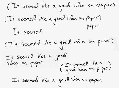
Actually, I’m not sure what I was trying to depict in those sketches. All of this sketching took place piecemeal over several weeks. I’d do some sketches, take a few days off to think about what works and what doesn’t, and exactly what kind of website Ironic Sans was going to be, and then do some more drawings. Then one day, while I had some down time on a photo shoot, I drew this:

Hmm, I thought. I’ll have to do a mock-up in Photoshop. But it seems like a good idea on paper. As soon as I had that thought, I realized I had hit on a good slogan that captured what I anticipated would be the tone of my website. And it gave me a direction for my website design. It seemed like a good idea on paper.
So I folded up the paper on which I did that drawing, and put it in my pocket. When I got home, I sat down with paper, pen, and ruler, and drew lots and lots of lines.

I have several pages with variations on these lines. Thick lines, thin lines, cross-hatched lines, sharp lines, freehand lines, ruler-guided lines, etc.
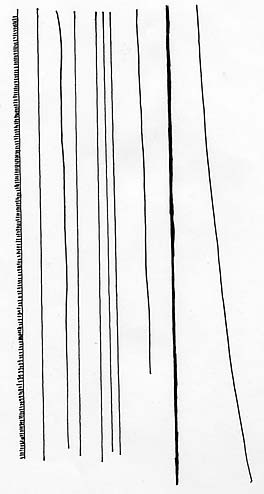
Then I drew the lines that would eventually be on the sides of the site:

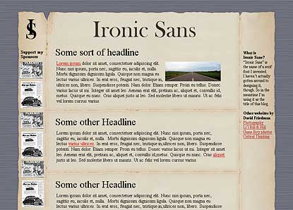
I scanned them into Photoshop and repeated those elements in different configurations making blog mock ups in various styles (three column, two column, etc). I don’t have the original Photoshop mock up, but it looked a lot like the drawing. I felt the site was looking a bit too cross-hatch heavy, though. All those lines dominated the page. I wanted the emphasis to be on the content, and not the design. The design should really be secondary. So I worked and re-worked it until I got it looking like you see it now.
I picked a serif font to represent the logo (Baskerville Old Face), printed it out, and used it as a basis for a freehand version of it.

I liked the logo, but I wasn’t happy with how the slogan looked. So I reworked it, creating the elements that eventually appear at the top of my site.
I repeated the process for the hand-written elements that appear in the sidebar and elsewhere.

Then all that was left was making decisions about fonts, link styles, etc. I struggled with the CSS for a couple weeks, trying to figure out why I couldn’t get it to look the same in Firefox and IE and Safari all at the same time, and coming up with workarounds to make everything come together. Finally, after all that, Ironic Sans was born.

Comments
I always loved the design of your site and now I know why. Because you actually put some work into it! Wow, I’m impressed.
Posted by: laanba | October 29, 2006 12:07 PM
I like your walk through David. Thanks for taking the time and good luck in the future.
Posted by: David Airey | November 9, 2006 5:15 AM
I also really like the look of the site. I’m glad you didn’t go with deco. :)
Posted by: Margaret | November 13, 2006 10:52 PM
I’m addicted to ‘StumbleUpon’ because I get to discover sites like yours…
I love your layout… I wish I’d have come up with it! Nice work!
Posted by: Jimmy the Geek | December 5, 2006 2:04 PM